Check out the Kansas City Tableau User Group
Cerner, T-Mobile, AMC Theaters, YRC Freight What do these companies have in common? They are all Tableau customers and are based in the KC Metro! Click to join our active local community!

Cerner, T-Mobile, AMC Theaters, YRC Freight What do these companies have in common? They are all Tableau customers and are based in the KC Metro! Click to join our active local community!

We all know how amazing and diverse this community is, I want #DataPlusMusic to be this community’s local record shop – join us to discover the new, reminisce the classics, debate the best & the worst. And learn a few things along the way! because this…is #DataFam Vinyl

Tableau is not what it is without it's incredible, rabid user community. This is just one of the MANY blogs out there. Click the link below to check out an always growing list of some of the other blogs in the community!

Disclosure: This post is sponsored by Sigma. As a Sigma-recognized brand advocate, I’ve been compensated for this content. As always, all opinions, bad analogies, and questionable pop culture references are entirely my own. Sigma dropped something yesterday and I stayed up late playing around with it Not in a “cool feature, moving on” kind of

Tableau has launched a free edition of Tableau Desktop, significantly lowering the barrier for individuals learning the software. This edition allows users to connect to various data sources and save their work locally, although sharing is restricted. This initiative is aimed at fostering community growth and making data visualization more accessible.
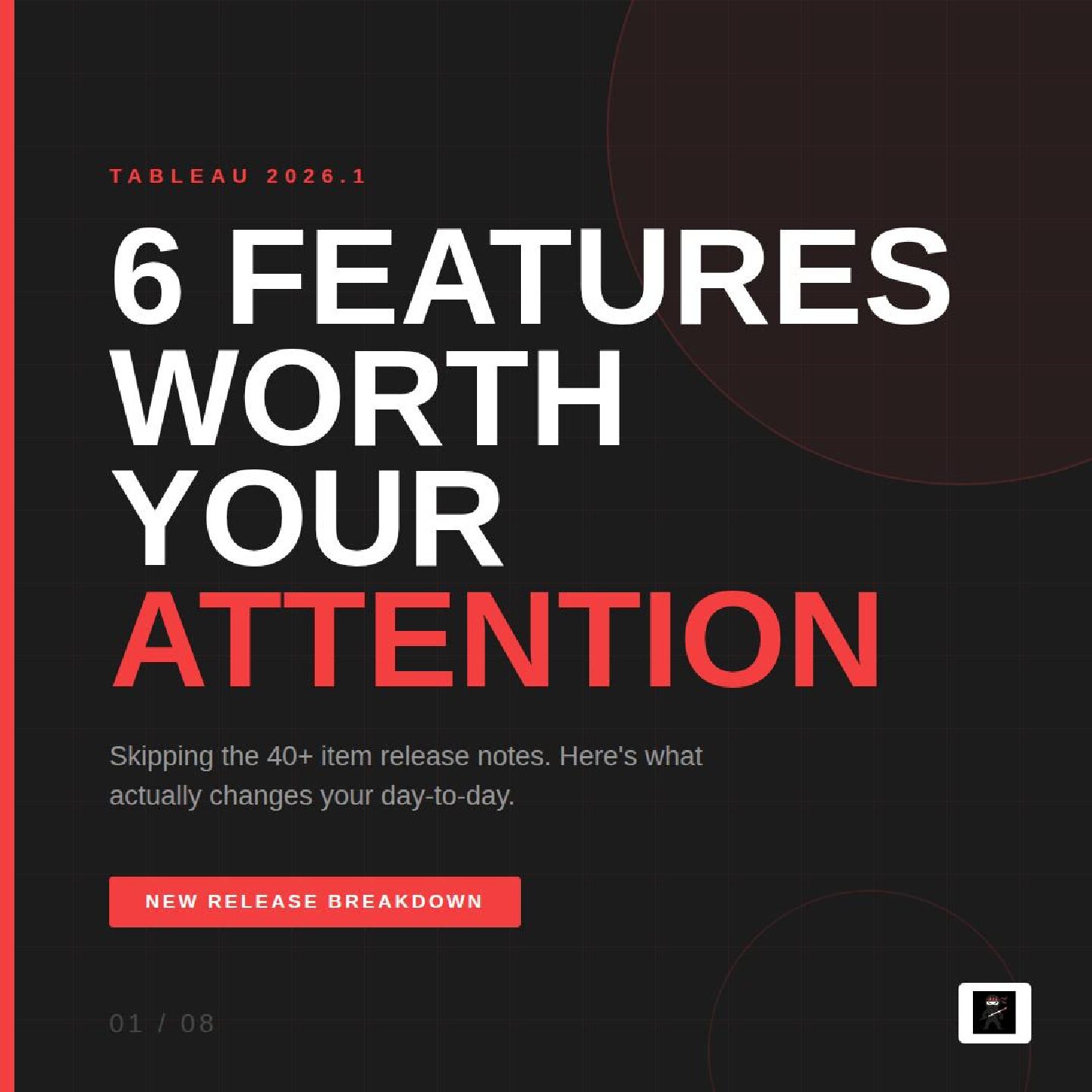
The latest Tableau release 2026.1 introduces six key features: rounded corners for improved dashboard aesthetics, enhanced monitoring for Tableau Bridge, AI-assisted color palettes, a REST API Connector for easier data access, spatial calculations in Tableau Prep, and in-database processing for Snowflake. Each feature aims to streamline user experience and efficiency.

DISCLAIMER: This is a Sigma sponsored post As I’ve been learning Sigma, I’ve been really impressed with it’s ability to blend spreadsheet/table analytics and full-blown interactive dashboards. And when you realize that because Sigma sits on top of you cloud data warehouse, you can also take advantage of your preferred AI LLM to take your

Workflow 2026, hosted by Sigma in San Francisco, showcased genuine innovations rather than empty promises. Key highlights included the introduction of Sigma Tables and Sigma Public, enhancing data sharing and community engagement. Sessions on AI integration and a new framework for building scalable applications emphasized actionable insights, culminating in Sigma’s commitment to replace traditional tools like Salesforce.

Read my full 2026 Workflow recap here. Last week, had the opportunity to attend Workflow, the Sigma user conference. It’s the keynote, the energy is up, Katrina and Zalak are putting on an amazing roadmap preview, and then in a nod to Apple keynotes, they pull the “One more thing…” move. They drop it. Sigma

DISCLAIMER: This is a Sigma sponsored post Welcome to my first blog showcasing how to build analytics in Sigma. I’ve been using Sigma for the past year or so and I have to say, I’ve been quite impressed with everything it can do. In this blog, I’m going to show you how to create an

🎤🎶 Data + Music Challenge: Concert Tours! Lights. Costumes. Set lists. That one encore you weren’t ready for. This quarter’s Data + Music Tableau Community Project theme is all about the magic of Concert Tours—and we want to see how you turn that energy into data viz! From now through September 30, 2025, create and

How have MLB salaries changed over the last 20 years. Check out this dashboard to see how the average and minimum salaries have increased.

The #WorkoutWednesday challenge from week 45 of 2023 tasks participants with creating a unit chart, a common tool in data visualization, with added filtering, coloration, and sorting features. The challenge encourages using a highlight and sort instead of a filter. The highlighted wines appear at the beginning of the chart, as shown in the accompanying solution video.