Episode 3: Census Data
…And we’re back for another week of #MakeoverMonday. This week we are looking at U.S. Census data! Yes, that deserves an exclamation point because this is such a rich and dense dataset that it, probably, the most widely used, no CITED, dataset in the U.S. I have no data to back up that claim but it is used an awful lot.
Anyway, the chart we’re looking at this week is this beaut…

What works well
- The title is ok
- The colors don’t clash
What doesn’t work so well
- There is a very low data:ink ratio
- All the labels get distracting quickly
- What year is this for? Nowhere on here does the reader know which year we’re looking at.
- The colors, while not clashing, are very bright. An excess of bright colors can quickly cause eye fatigue
- Ugh, again with the stacked bars. They are quite popular for showing part to whole in a nice & neat block of space. But similar to pie charts, the more segments added along with the more dimensions (states, in this case) then the harder it becomes to make comparisons across the dimensions
So as soon as I saw the data and read the article, my first thought went straight to a tile map. Probably due to the fact that, as analysts, we have this innate urge or temptation that the moment we see geographic data we must make a map! Why, why is that?
Well, as I make my way through these #vizgoals of mine, a subgoal of them is to try out chart types that I’ve not tried before. This dataset is pretty easy to work with and seems like the best time to figure it out.
So I followed the very excellent tutorial from Matt Chambers on how to build a hex map. That was simple and straightforward. Then as far as layout is concerned, I didn’t like all the different pay ranges, and I felt I could group them into 6 larger groups that make them easier to consume. Plus I added names to the groups that the layperson would quickly understand. This led to the creation of:
- Poverty
- Lower middle class
- Middle Class
- Upper middle class
- Wealthy
- Very Wealthy
And it just ended up as 6 groups and sense 6 is even, that lent itself nicely to a small multiple layout. Here’s my finished product. Click here for the interactive version.

I even packaged them all nicely with their legends in some vertical containers which were nested in horizontal containers so it looks really nice from a layout perspective.
But you know what? This is pretty not great. It’s very difficult for me to gain any insight from this. This is more like a pretty picture than something I would use for analysis purposes.
So, I think I actually need to makeover my makeover…
Back to the drawing board
So what’s funny is that I knew this was not very good as soon as I starting putting the dashboard together. But as I mentioned, I wanted to build a tile map because I’ve never done one. So I went ahead and finished it knowing that I was going to have another go at this dataset.
The similarities between the original and my v1 were it is very hard to draw conclusions. There is no story in them at least at a quick glance. The reader has to spend a lot of time looking at this to find a story. That should not be our goal. Our goal as analysts is to put the story together and serve it on a silver platter.
So when I looked at the data that was given to us, we have these income percentages for each year back to 2009 for each income level. So the question that popped up in my head first was:
Are states increasing or decreasing the share of households in the lower income brackets over time?
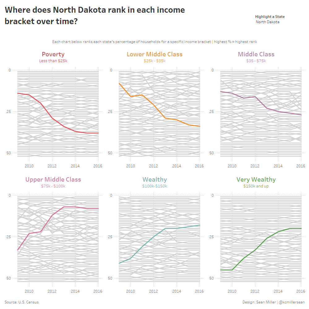
So to do this, I chose to do a bump chart. Again pulling from a tutorial from Matt Chambers. Bump charts are really good at showing rank comparisons over time.
One thing that I really liked about my v1 was the tiled layout, so I kept that structure the same, with the same income brackets grouped together. Here’s what I came up with to:
- Improve the original and my v1
- Gave readers a story to read and investigate
- Reduced the time to insight (h/t: Ryan Sleeper)
Here’s my finished product. Click here to interact

Cheers!