Tableau Ambassador, former #IronViz champion and an all-around good guy, Curtis Harris is back with a fun #SetAction themed #WorkoutWednesday challenge for week 47. Let’s take a look

and here are the requirements:

Nice and simple. Should be fairly straightforward.
Whenever I go about these challenges I like to build out the skeleton first. Then I’ll focus on interactivity and lastly I clean everything up with formatting.
Let’s look at this top to bottom and keep in mind the second requirement, this dashboard can only be 3 sheets. Additionally, after exploring Curtis’s interactive versions, I can see that the three distinct sections
Skeleton
- BANs
- The first BAN has some additional text for context. I can also see that these BANs change color based on the selected region
- A heavy weighted line for separation
- after closer inspection, these are 4 small rectangles that change color based on the selected region
- A line chart combined with an area chart
- When nothing is selected, it’s a single line, and when you select a region from above, the line chart splits out to an area chart for the selected region and the original filters to all non-selected (other) regions
Let’s start building
BANs
I can see from the interactive version that this is all one sheet. So I’ll start by creating a sup’ed up text table with [Region] on columns. I’ll also put [Region] on the text shelf of the marks card along with [Quantity]. But before I do that I’ll create a calculated field to change all regions to uppercase
UPPER( [Region] )

So now I need to handle the additional contextual text for the first BAN

Apart from the [Quantity], I’ve got:
- “UNITS SOLD | ” for the first one
- “IN THE |”
- [Region]
- First one in bold, others are regular weight
- “Region”
- Bold weight for first one only
After some trial and error, I can tell you that each of those bullet points is a separate calculation. Now, there are multiple ways to go about doing this. There’s the static [easy] way:
IF [Region]=”Central” THEN … END
Or there’s dynamic [harder] way. Dynamic meaning, maybe you want to sort these BANS by a measure on a live data source and therefore you want it for the just first dimension regardless of sort. That will involve a table calc of sorts. And again you’ve got some flexibility and you have primarily two options; FIRST() or INDEX()
I chose to go take the former approach. So my calculations looked something this:
IF FIRST()=0 THEN “IN THE | ” END
NOTE: I know it’s silly but Tableau starts counting at 0 for both FIRST() and LAST() functions while it’s counting at 1 for the INDEX(). Just keep that in mind of when using those functions.
I copied the above formula and changed the output for each of the bullet points above. In order to get the first [Region] to be bold weight and the others regular is to write two separate calculations
For bold:
IF FIRST()=0 THEN [Region] END
For non-bold:
IF NOT FIRST()=0 THEN [Region] END
So now I have five new BAN fields and I’ll put them all on the text shelf of the marks card. It’s gonna look funky until I do some moving around and simple formatting. But here’s what you want your text card to look like when you all done.

I also made sure to set the table calc to compute using the dimension I have on columns.
While I’m here, I went ahead and created the first set so that when I’m ready to add interactivity, it’ll be ready. I’m going to create it based on the field that created to get the regions to be upper case

I’m going to put this new set on color. So that when I use my set action later, I’ll get the color to show correctly. So now to get this just right, I’m going to go ahead and edit the set that I just made to include any 1 member.
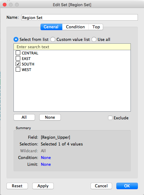
And now, I see two colors on my sheet and now I can go in and edit those colors to what I want. I don’t see any hex codes in the requirements so I’m going get it as close as I can. I ended up using:
- Dark Grey – #63737d
- Blue – #3d78a9
And with that, sheet 1 of 3 is complete!
Separation Bar
The next thing I’m going to tackle is that heavy weighted bar that separates the BANs from the line chart
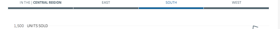
After further inspection, I can see that it changes colors for whichever [Region] is selected. That tells me that this is actually a sheet with some interactivity as our BAN sheet.
This one took me a little while to figure out but eventually, I did. What I did was essentially create a blank highlight table that would be driven off the [Region] set that I made in the previous section.
It starts off very similar to the BANs sheet with the [Region] pill on columns. Then in order to create a highlight table, you need a continuous measure on color with the mark type set to square. And that means I needed to create a calculated field that creates a continuous column based on what’s included in my set.
IIF( [Region Set] ,1,-1)
This is simply a binary field that I’ll use on the color shelf and will edit my colors to be a custom diverging color palette using the hex code colors I referenced in the previous section. I’ll set the number of color steps to two and hard code the diverging point to zero. Like this:

And you end up with something like this:

and just like that Sheet 2 of 3 is complete!
Combo Line/Area chart
I can tell from the picture that we’re looking at quantities per month over time. I also read the requirements carefully and it says that when you hover on any Month/Year I should see the [Quantities] for each same month, regardless of year. The first thing that pops into my head is “I’m going to have to do something discrete date parts at some point.”
Since that’s the case and I also see that I’m using a continuous month date as the x-axis in the chart, I’m going to write a calculation to truncate the [Order Date] to just the months
DATE( DATETRUNC( “month”, [Order Date] ) )
Tableau will default this to a discrete [blue] pill, which is exactly what we need because blue date pills represent discrete date parts and Tableau needs date parts in order to find the same month regardless of year. And this field is what we’ll build our other set off of.

And again, for testing purposes, I’ll just add one member to the set.
Now to the build the view for this chart. We need to put our new month field on the columns and quantity on rows.
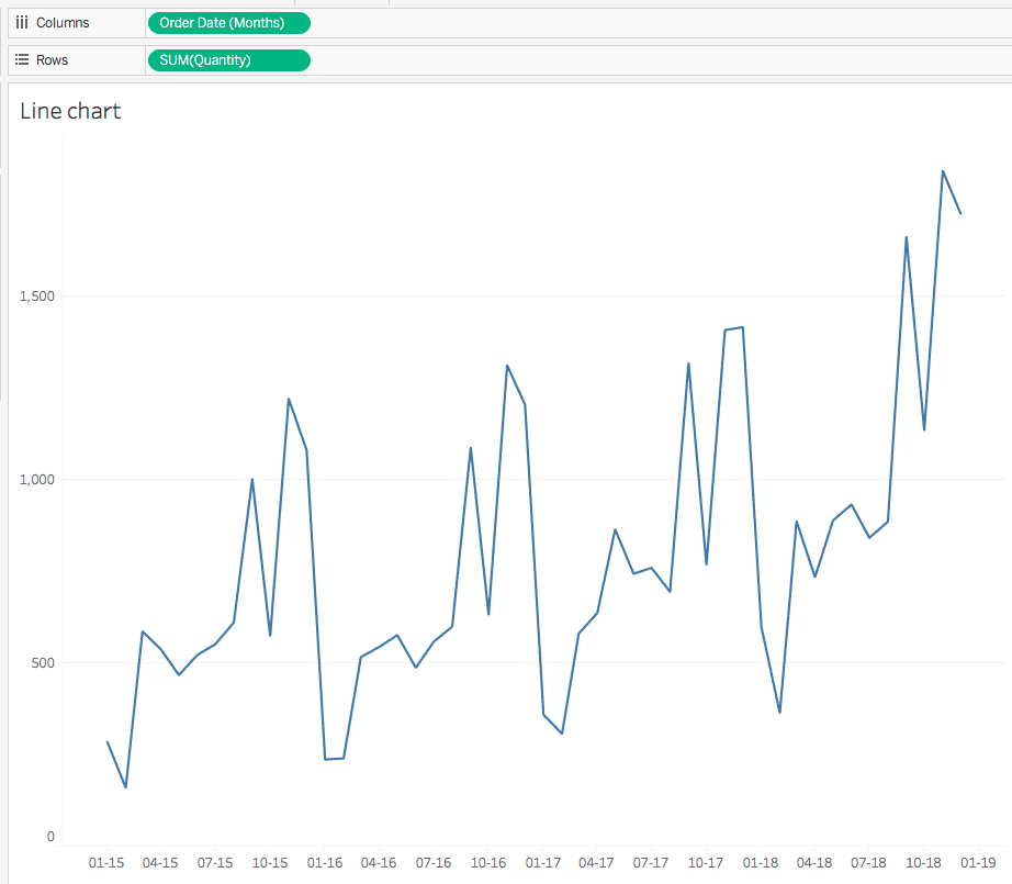
Cool. Now I need to separate this out by our region set so I throw that set on color
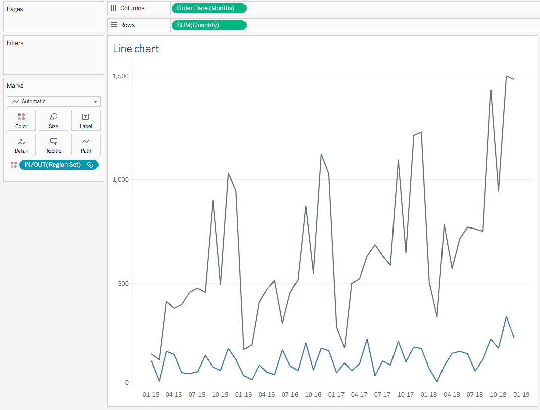
Now, I need to figure out a way shade just the area under the blue line for the selected region(s) in our set. This is simple enough. We just need to return the quantity only if a particular region is in our set. So that will look something like this
IF [Region Set] THEN [Quantity] END
Now I should be able to add this field as the secondary axis and change the mark type to an area chart.
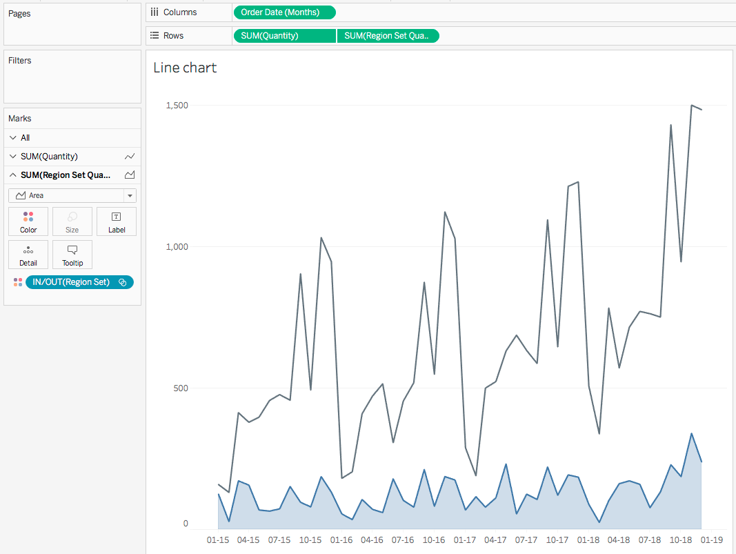
Oh yeah! This is coming along nicely. Okay next up tackle the requirement regarding the “UNITS SOLD at the nearest 500 gridline”. So I know that I want it to eventually be a reference line. I need to find the highest value in the value and find the closest number in 500 increments to that number. Here’s how I did it
ROUND ( WINDOW_SUM( SUM( [QUANTITY] ) ) / 500 ) * 500
Okay, I know that may look confusing but let’s break it down to see exactly how this is working. If you remember my tip from last week, whenever things get too complicated, go back to your roots and look everything in a text table. I’ll create a new sheet and put [Order Month] on rows and [Quantity] on columns.

Now, let’s work from the inside of the formula to the outside. The innermost portion of the calculation is SUM( [Quantity] ) and that’s already on our sheet. Now let’s bring the next part out, the WINDOW_MAX().
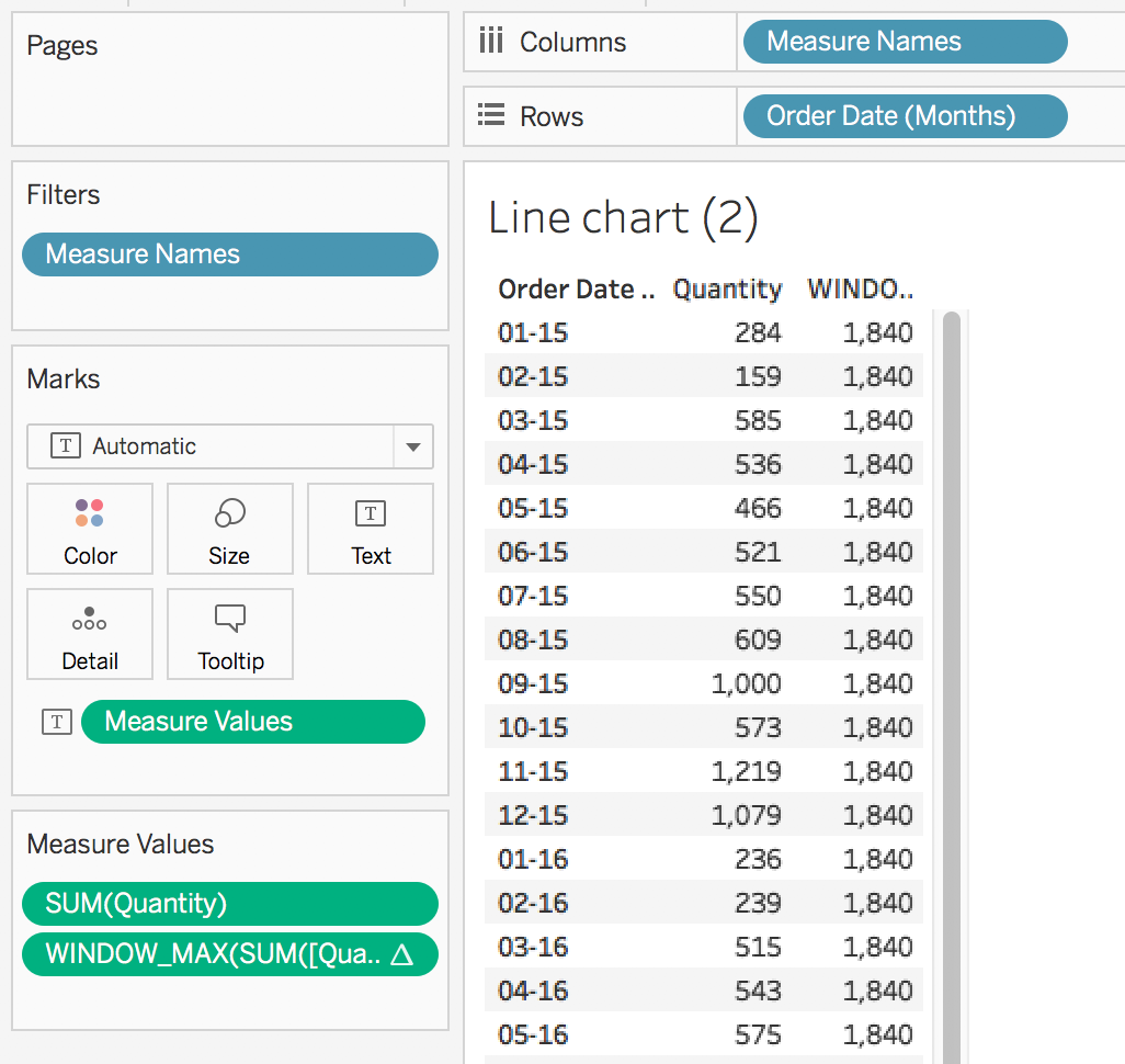
Now let’s divide that 1,840 by the 500 and round to the nearest whole number

and now we multiply that by 500 and we get…

which is the first number divisible by 500 greater than the maximum number!

Alright, we are in the home stretch. All I have to do now is write a calculation that will give us our mark labels. Admittedly, this took me way too long to figure out originally. Like long enough that I had to walk away from it for several hours. Lucky for you, you get the “cooking channel” version where everything already works. Sooooo you’re welcome!
So here’s the calculation you need to get the mark labels to appear.
IF MONTH( [Order Date (Months)] ) =
MONTH( { MAX( IF [Month Set] THEN [Order Date (Months)] END ) } )
THEN [Quantity]
END
So, why does this work? What’s it doing? There’s a lot to unpack here. We’ve got a nested if inside of an LOD. Again, work from the inside out. Let’s first look at the nested if.
When I hover on a mark, I’m going to be updating the month set to include that Month/Year. The nested if says take the month number and by fixing it to the entire table, we’re able to check each month/year mark on the line and where they are equal, return the quantity.
And does it work?

YOU BET IT DOES!
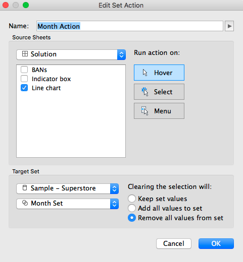
Now, I’m ready to assemble the dashboard and add our actions. The first action that I’ll create will be on that changes the view based on the region selection.

Then I’ll create the hover action to see the mark labels by discrete month.
And with that, all that’s left is some very simple formatting and voila! Click the GIF for the interactive version.

GO FORTH AND VIZ!