After 51 weeks, we’ve finally made it to the last week #WorkoutWednesday for 2018. Ann is back for this challenge and she’s GONE ROGUE!!! No, just kidding, but she did stray away from the Superstore Sales dataset which is pretty cool. So here’s the challenge and a screenshot of the final dashboard:

I’ve noticed this trend with the last few challenges, where the others are bringing their real-world challenges into the community. I think this is really cool and hope it continues because these by solving these types of problems will only help when “we” are faced with challenges we’re not sure how to solve off the top of our heads.
So in Ann’s intro, she referred to this (four times) as a timeline but what I see from this picture is a connected dot plot so that’s how I’m going to approach this. Now what interesting about this dataset is that Ann explicitly instructed us NOT to reshape the data, we must recreate this from the dataset we are given. So why is that such a big deal? because this connected dot plot is plotting dates:
- A birth date
- An award date
- A death date
I’ve used connected dot plots several times because I think they are really great. But the one thing each dot plot has in common is the measure we’re interested in is in a single column. And if we look at this dataset, we can see that the granularity of the data is one row for each recipient per award. So our data is at the person level meaning each of the dates we’re interested in above is in separate columns so I’ll need to figure out a way to bring those three dates together in such a way that I can create this.
As I started playing around with this is because evident quickly that I needed a way to get these dates on the same axis and I remember from my pre-Tableau days when I was doing everything in MS Excel, I remember that dates are nothing more than fancy formatted integers. So with this, I went and converted each of the dates to integers using the INT() function. This was pretty straightforward except I wasn’t getting a mark for those who were still alive. I was able to fix this issue by asking Tableau to look at each row and if the [Death Date] is null then return today’s date.
INT( IF ISNULL( [Death Date] ) THEN TODAY() END )
Then I used Measure Name/Measure Values to set up the “dots”:

Many of you might struggle with getting the colors just right. I know I did for a while. I struggled because I only wanted to color the category date dot and not the birth or death dots but you can’t because you can’t use Measure Names/Measure Values in calculated fields…yet. But then I remembered a trick that is easy to forget. Are you ready? You can put MULTIPLE discrete dimensions onto color but there’s a very specific way you have to do. You can only drop a single pill on the color shelf of the marks card. When you attempt to drop a second one, it will replace the first one. BUT if you drop the second pill onto any of the other shelves of the marks cards, you can then force it to the color shelf. To see what I’m talking about check out Curtis Harris’s walkthrough video where he talks about this technique. Watch the whole thing but you can skip forward to 11:20 to see this technique.
After doing that I’ve got something like this

And now, I’m ready to add the connecting line. Now in the past, I’ve always just duplicate the measure, changed the mark type to line and placed the specific discrete dimension I used to the path shelf and it all was dandy. But that won’t work in this case because I would have to put two dimensions on path and that just doesn’t compute so I’ll have to go about this another way. Luckily, like many things in Tableau, there are multiple ways to do this. The other prominent way is to use a gantt bar.
I’ll use the [Birth Integer] as the starting point for my gantt and I’ll have to write a calculation to get the length of the gantt just right. I need to take the largest integer and subtract our smallest integer.
MAX( [Integer Award] , IFNULL( [Integer Death] , INT( TODAY() ) ) ) – [Integer Birth]
Did you know that you add multiple arguments into MIN() & MAX() functions and Tableau will return the correct value? It’s pretty cool. I only learned that this year thanks to a previous #WorkoutWednesday challenge! #AlwaysLearning
So for each row, evaluate the two columns [Integer Award] and [Integer Death] however if the latter is null, then replace with today’s date; then take the larger value of the two and subtract [Integer Birth]

Alright, now I’ll make it a dual axis and adjust the sizes of the marks and everything is coming together.
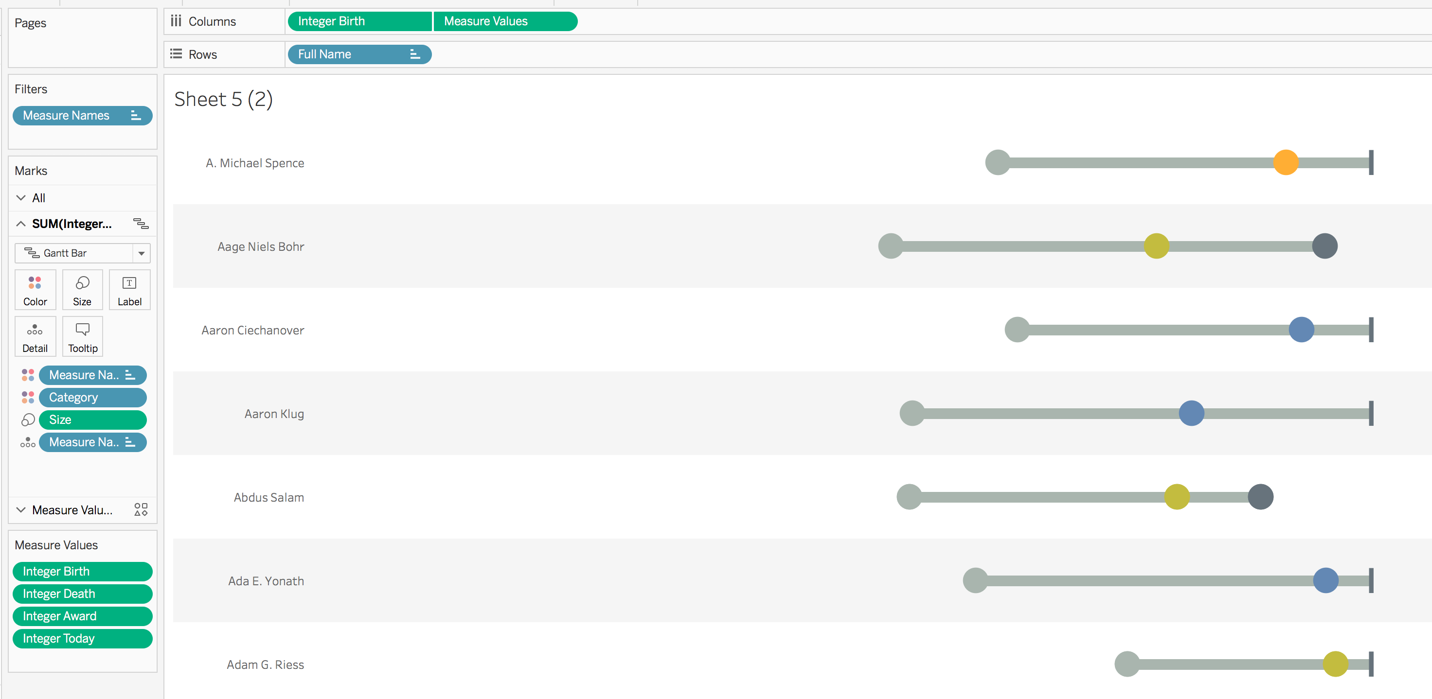
Now the last big thing to figure out is the bar label. We can see that it centered on each line and is under the line. It includes the name of each recipient and their birth date and death date or today if they are still alive.

Now this is an interesting problem because you can’t mix dates and strings together and you convert a date into a string, you lose the ability to format the data in a specific way. And string dates are defaulted to yyyy-mm-dd, which you can see is not the right way. So I created this calcuation to get around this problem
IF ISNULL( [Death Date] )
THEN “TODAY“
ELSE STR( [Death Month] )+’/‘
+STR( [Death Day] )+’/‘
+STR( [Death Year] )
END
And viola! Click for the interactive version. I took the liberty of adding a filter action on Category…just because I thought it need one 😉

GO FORTH AND VIZ!