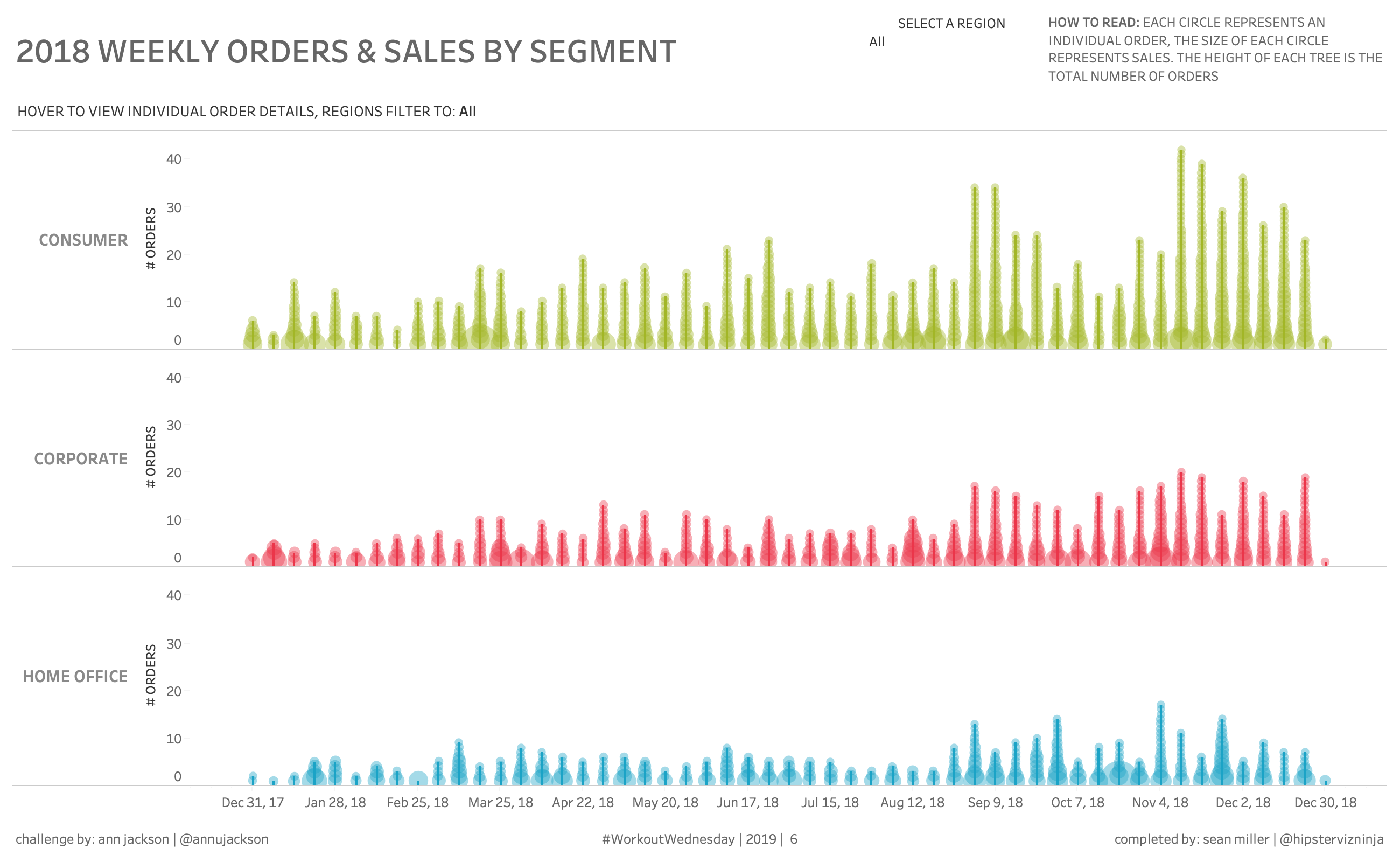
#WorkoutWednesday2019 week 6 is here | don't get fooled by the pretty trees, this chart can easily be re-purposed for a business setting and includes a few little formatting tricks for good measure | blog: https://t.co/5slLIhIukT | full viz: https://t.co/ueS0wPAOEC pic.twitter.com/8RfwrAKx1s
— Ann Jackson (@AnnUJackson) February 6, 2019
Well this looks fun and new! TREES?! In a viz? In a business-focused dashboard? Well let’s do this, I’m excited. Here’s a larger view of what we’ll be doing in this post. You can check out all the details and requirements, here.

Okay, so on the surface this is a dual axis chart with a column for each continuous WEEK( [Order Date] ) (we know this because of the date format at the bottom); and a row for each [Customer Segment]
We can also see a y-axis of number of orders with bar making up the tree trunk. And then we have the circles on each bar sized by the amount of sales. Each circle is an individual order. Lastly, we have a VIT (viz in tooltip) detailing each order by the sales and quantities by sub-category.
Let’s start building
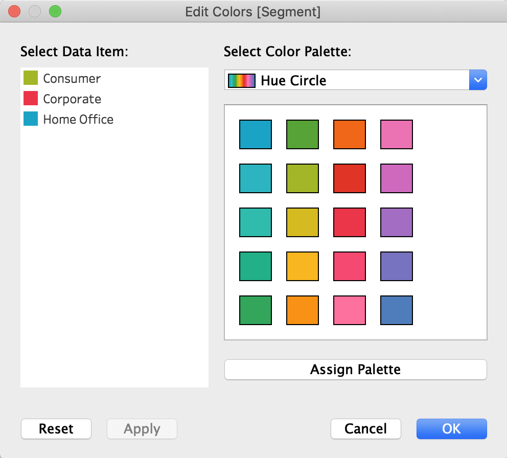
Let’s put [Week of Order Date] on column and [Segment] on rows. While I’m here, I’m going to go ahead and set the default color for [Segment]. I can’t tell from the directions what colors Ann chose but it looks like she may have used the Hue Circle palette
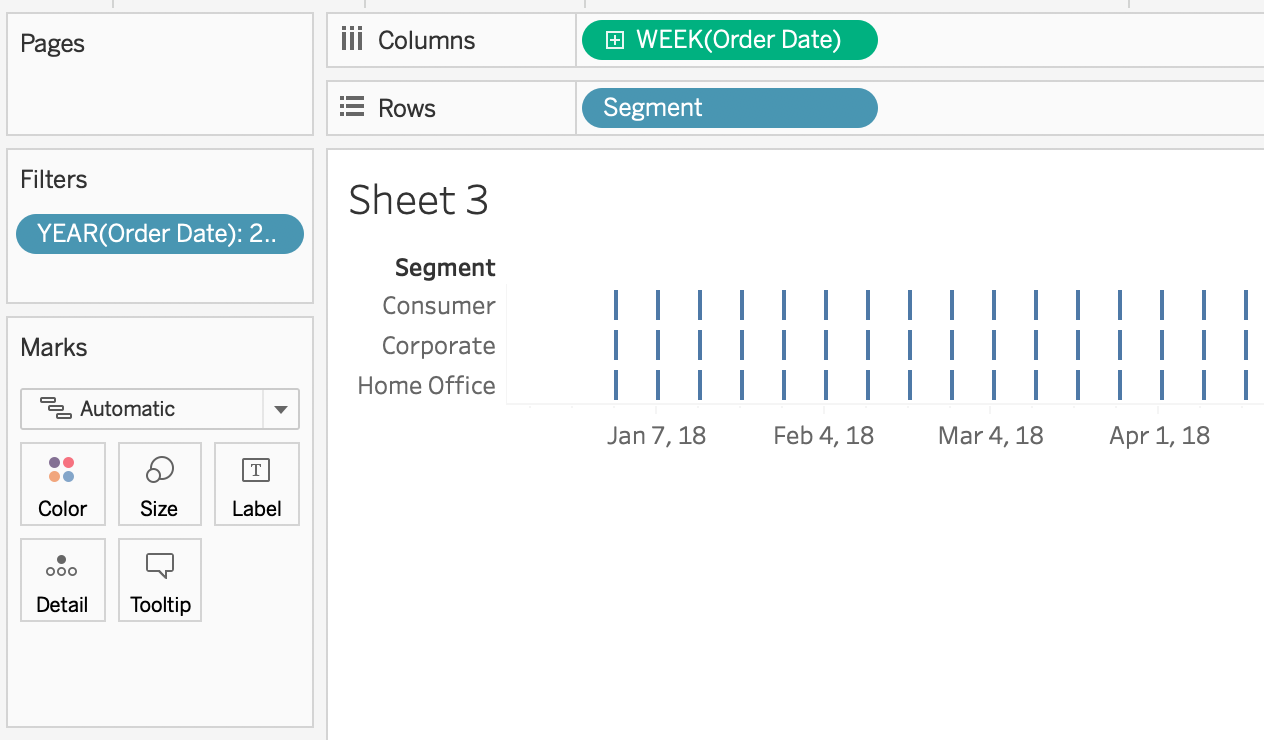
Well, you can’t have a tree without a trunk so let’s start there. Those are just the number of orders for each week.

Simple enough, right? Now for the slightly difficult part How do we get all of the individual orders.
Real talk: I spent more time than I’d care to admit figuring this out. I was SOOOO close to downloading Ann’s workbook to see how she did it but I said, “NO! Sean, you will figure this out!”
And then, just after I said that to myself, it hit me – THIS IS AN ANN JACKSON CHALLENGE! And that can only mean one thing. There will be table calculations involved. Oh yes, there WILL be table calculations.
Now, there are probably a couple ways to solve this but the one that first popped into my head was a running total. So when I duplicate my CNTD( [Order ID] ) we select the “running total” quick table calculation.

But now we need to edit our table calc to ensure that we are computing our running sum along the [Order ID] field. And we also need to edit the sort order option because Ann said we need to order the orders descending by sum of sales

Now the next thing to do is to put SUM( [Sales] ) on the size shelf of the circle marks card. and adjust the size and transparency and get them as close as you can
Sync the axis, remove the secondary axis header and move the table calc pill to be the main axis and…
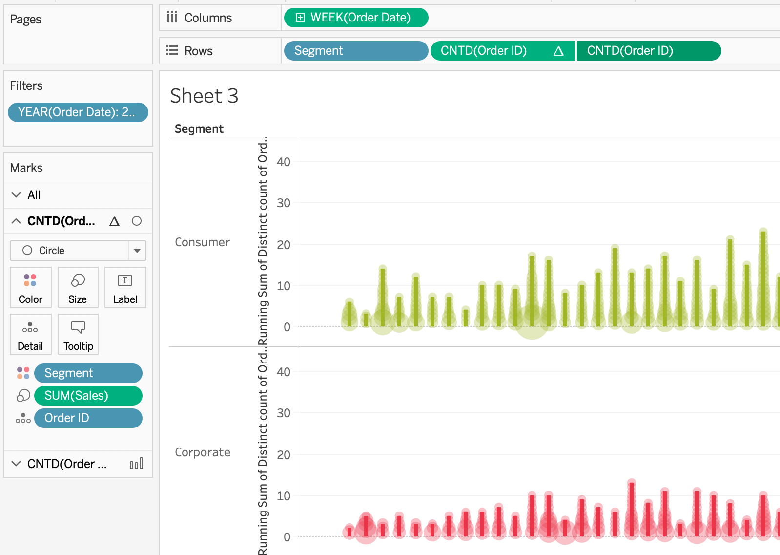
Now all that’s left on this sheet is to remove gridlines, edit the [Order ID] axis to start at zero, edit the fonts and sizing of the row labels and we’re ready to tackle the VIT.
Whenever you hover on any mark, [Order ID], a detailed breakdown of the order pops up.
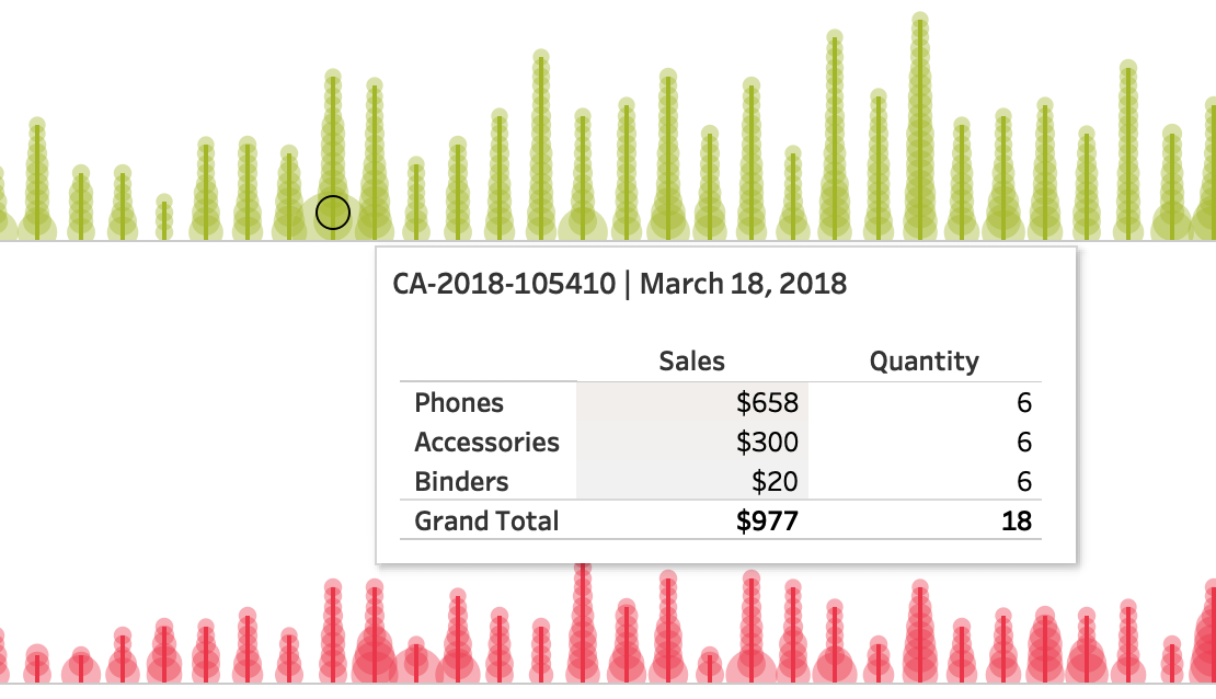
It’s crazy to think that viz in tooltips are only just now a year old. they were released in January 2018 with Tableau version 10.5!
Okay, we need to setup a new sheet with [Sub category] on rows and I’ll use Measure Names/Measure Values to select [Sales] and [Quantity] on columns and include a grand total for our Measure Values.
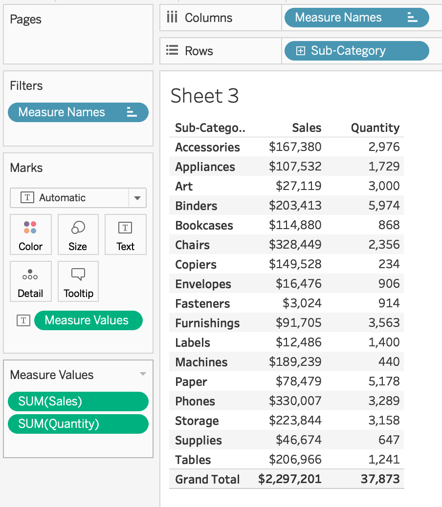
Ann’s directions say to color the sales column orange sequentially by Sales and no color on the quantity column. Luckily this is really easy to do since Tableau allows us to put measure values on the color shelf and apply separate legends for each measure name.

Now, we edit the sales color scale
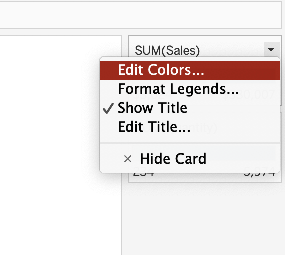
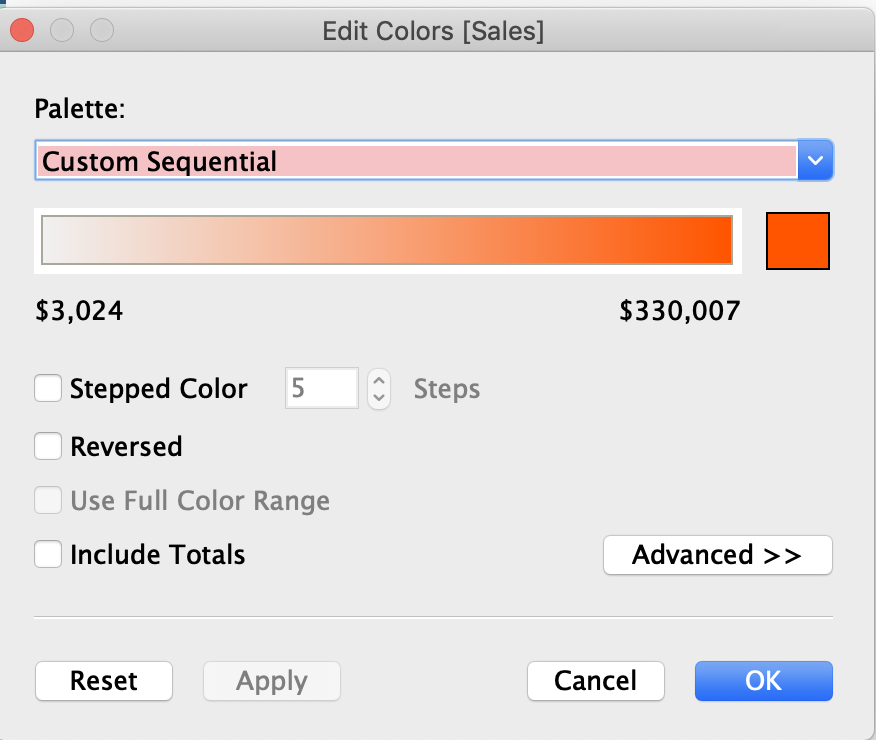
to make it a custom orange sequential scale
Now we also need to sort the view based on sales. So we end up with view like this
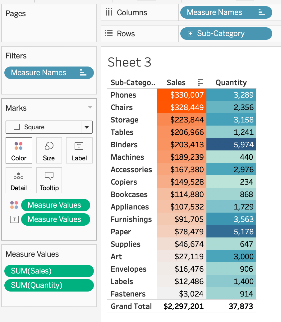
and now to make the Quantity column have no color we, can do the same thing except we’ll do a DIVERGING scale and both of our colors will be #FFFFFF

So now our view looks like this
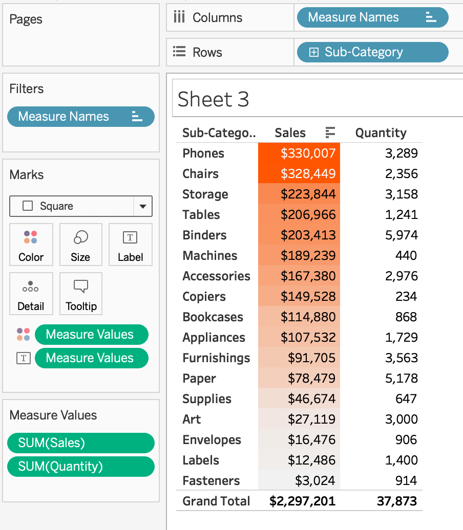
Now we’re ready to add it to the tooltip of our first sheet
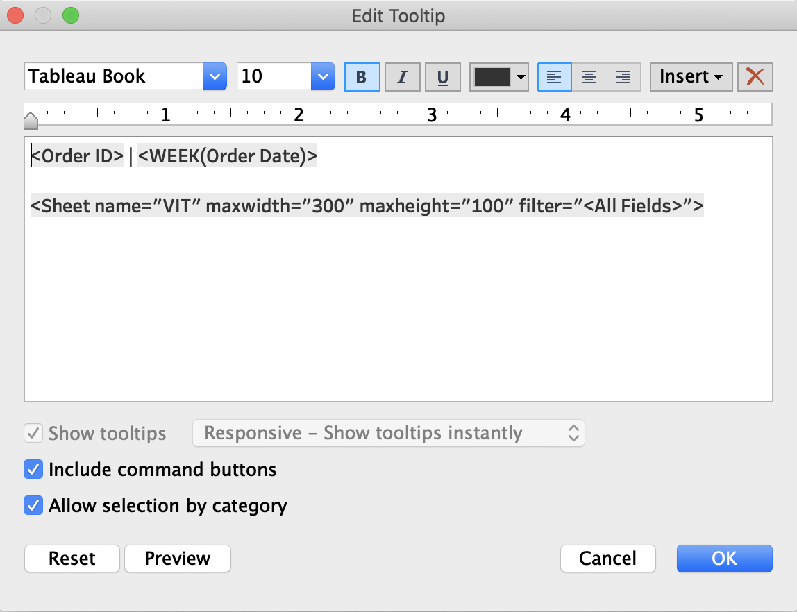
I set the max height to 100 pixels after some playing around to make it look just right.
And there you have it, just a bit more of minor formatting and it’s we’re all set!
Click the dashboard to see the interactive version
GO FORTH AND VIZ!
