Before I get started I wanted to take a moment to thank this wonderful community for all the feedback and kind words shared about this project, #20for20Tableau. To be honest, I had a feeling that a few folks would be interested in this but I had no idea it would get this reception. So THANK YOU!
The Data
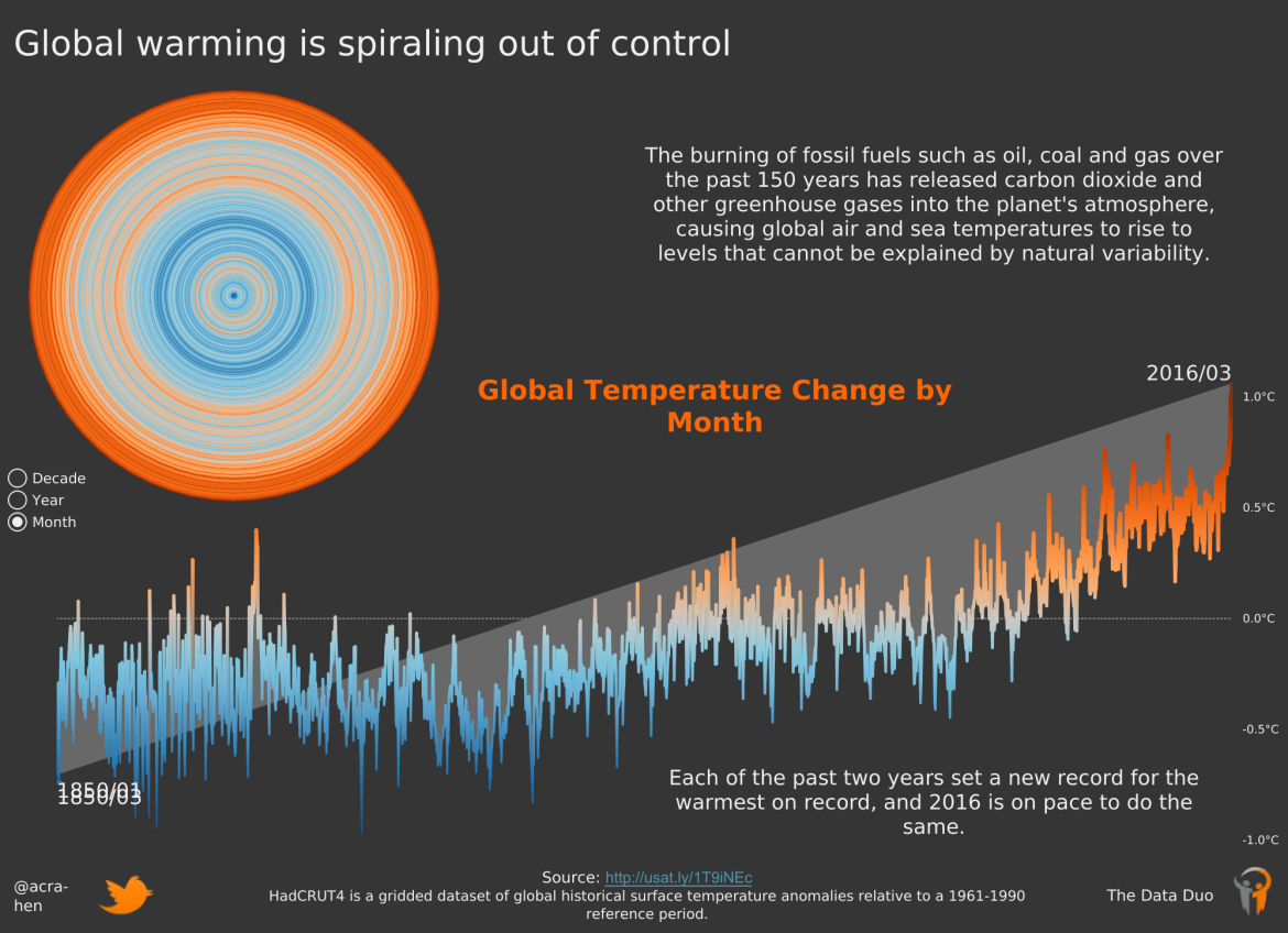
Without further adieu, lets dive into the first data set. This dataset comes from the Met Office Hadley Center. What this dataset covers is the land surface air temperature anomalies of every month going back to January of 1850. Let’s take a look at a sample of the data.
|
month_date
|
anomaly_value
|
upper_95_ci
|
lower_95_ci
|
|
1850-01
|
-0.7
|
-0.757
|
-0.627
|
|
1850-02
|
-0.286
|
-0.342
|
-0.218
|
|
1850-11
|
-0.187
|
-0.242
|
-0.133
|
|
1858-05
|
-0.653
|
-0.718
|
-0.605
|
|
1933-05
|
-0.213
|
-0.296
|
-0.14
|
The first thing you’ll probably notice is the second column is not temperatures in terms of celsius or fahrenheit; rather these are the difference of the earth’s average land surface air temperature for that month/year and a thirty year reference period. According to the documentation that reference period is from 1961-1990. The Met Office determined the earth’s average temperature between 1961-1990. That’s 30 years, 12 months a year for a total of 360 data points to create the reference period value. The other two columns are the confidence intervals for each anomaly.
The Inspiration
I chose to kick off the project with this dataset because this was the 20th dataset of the dataviz community project #MakeoverMonday. That’s right, #MakeoverMonday was only 20 datasets old and very much in it’s infancy. Check out this tweet from Andy Cotgreave tracking total participants
Well done to all involved in #MakeoverMonday. Your work is blowing me away. All ONE HUNDRED AND FIFTY of you! pic.twitter.com/zV8bMpZut3
— Andy Cotgreave (@acotgreave) May 17, 2016
Think about that, only 150 unique people had participated (TOTAL!) leading up to this dataset. Then you compare that what happened in 2019.
What a year for #MakeoverMonday! 23 people completed all 53 weeks. 1700+ participants. 7300+ submissions. Incredible! And this is only the people that chose to submit. Well done everyone! 2020 tracking starting next week. See how you did for 2019 here: https://t.co/Y6VXC72e3e pic.twitter.com/SVpHB12Xpc
— Andy Kriebel (@VizWizBI) January 4, 2020
Simply remarkable.
So what did the community produce with this data back then? Thanks to the hashtag and twitter’s advanced searching capabilities; the best way to explore is to click this link.
Here are a couple of my favorites


Radial Bar Chart from Curtis Harris
Yearly histogram distribution from Andy Cotgreave

Small multiple area charts from Steve Fenn

Mobile-First Vertically oriented dot plot by Michael Mixon

And yes, while it is FAR from my one of my favorites, also submitted a viz for dataset

It’s something…
The Challenge
It’s simple, really. Make something with this data. The deadline is up to you. This is not a time boxed challenge at all. As you can from all the vizzes above, there is SO MUCH potential in this dataset. And get this folks, each of these creations were done in a PRE-Tableau 10.0 world. Think about all the advancement the product has made since 2016!
I can’t wait to see what you create. All I ask is that you share it with the hashtag #20for20Tableau, on Twitter and on Tableau Public.
I’ll be back in a couple weeks to share with you what I create. Until then…
Go for and VIZ!
2 comments on “Dataset Deep Dive | Global Temperature Anomalies 1850-2019”