Scenario:
Your chilling at home one evening scrolling through Twitter when you read an interesting tweet. Something about that tweet piques your interest and if you’re a #dataviz person like me, your first thought is “how can I visualize this?” then you might ask yourself “does data exist?” or “how hard would it be to for me to acquire this data?”
Sound familiar?
Well this is exactly what happened to me that other night and this was the tweet in question:
At 98.8 mph, to bring decimals into it, that was the fastest pitch a Tigers player has taken deep since pitch tracking began in 2008. https://t.co/zwSaNAM7YA
— Andrew Simon (@AndrewSimonMLB) June 25, 2018
Now, I don’t know about you but this tweet just SCREAMS #dataviz. So that’s what I set out to do.
Step 1: Get the data
Did you know that MLB makes every pitch and every play available to the public for analysis? The site is called MLB Savant, it’s run by Daren Willman and he has created a web form that users can query to answer questions to their heart’s content.
So from the tweet, I know that I needed data back to 2008 (10 years). You can see from the tweet that we’re talking about home runs. But that’s good enough to scratch my itch. No, I want to look at ALL possible outcomes, not just home runs.
Daren has put set the row limit on the queries to 40,000 rows. So in order to get all the rows that I need I have to chunk up my downloads separately. Now I have 2 files for each year. One for every single and another file for all double, triples and home runs together.
This was also a great opportunity for me to use Tableau’s new data prep tool, Tableau Prep. I was quickly able to bring in all of my files through a wildcard union then join that to a player_id matching file so I could have the name of each hitter and each pitcher. Then I created a couple new fields and removed a bunch of unnecessary columns that I wouldn’t be using for this analysis. In the end, my flow looked like this:

Nothing too crazy or complicated but was a good learning exercise nonetheless.
So now, I’m ready for Tableau. I went back to the original tweet that started all this and looked at the information it provided.
- Speed of pitch
- Team of hitter
- Hitter name
- Pitcher name
- Result of hit
So as I looked at this and thought about how I wanted to visualize it, I went through several worksheets of ideas but I wasn’t really crazy about any of them. So I saved my work and left it alone for a while.
Then later that day I came back to it and it hit me. A strip plot would be a great way to visualize this. So here was my first pass

This is terrible. But also a point for implementing best practice. One of the tenants of #dataviz is to never rarely truncate your axes. But in this case its appropriate because:
- It’s impossible to read otherwise
- We are analyzing MAX pitch and will never be 0 miles per hour
But what should I truncate it to? I played with several options but finally decided to set the bottom limit to the overall average pitch speed for all pitches in my dataset.

This looks much better. This is exactly what I set out to visualize. And now I want to add some more details regarding each of these dots. Yep, it’s time to start thinking about tooltips. And with Tableau 10.5, we now have the ability to add additional vizzes in the tooltip!
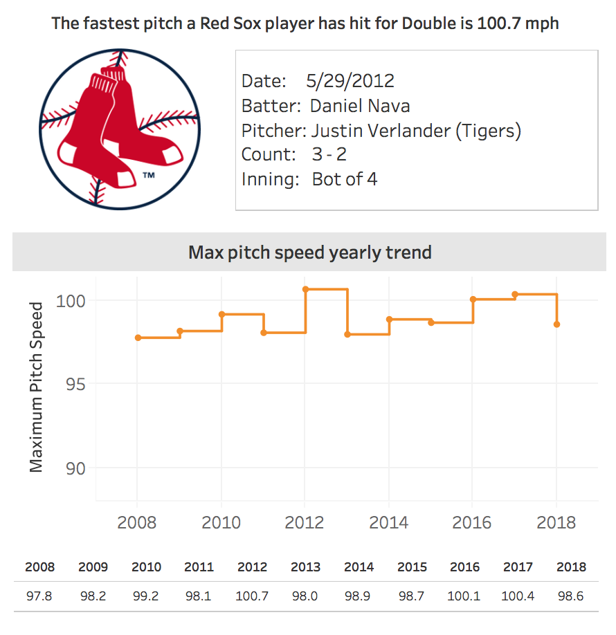
So what I decided to do was essentially create a second dashboard and display it in the tooltip. I knew I wanted to add some context to that particular hit just like in the aforementioned tweet, so I created a worksheet like this

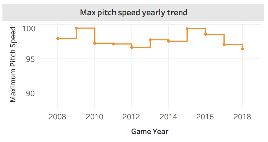
Then I figured I like to see a trend of the fastest pitch be that team over all 10 years. This is a perfect use case for step lines and here’s what that looks like

If you follow these stat nerds regularly you know that they are really interested in the numbers so I added a text table to show the individual values

I added the hitting team logo for panache and when you put it all together you get a tooltip that looks like this

Let’s put a bow on this

