Well hello there! Whether you’ve read my blog before or you’re here for the first time – Welcome to the first edition of a new weekly challenge, #PreppinData, spearheaded by Carl Allchin, “The Other” head coach at the The Information Lab Data School, and Jonathan Allenby, consultant at The Information Lab.
In the same vain as #WorkoutWednesday, #PreppinData is geared toward those individuals who are new to Tableau Prep or those who want to learn more about it’s capabilities. This is very exciting and is something I think was missing in the community.
As per the usual here at MyDataMusings you’ll find my solution(s) to other weekly challenges such as #MakeoverMonday and #WorkoutWednesday.
Similar to Tableau, there are multiple ways of solving the same problem in Tableau Prep so it’s my hope that by reading through my posts you’ll pick up a few new tips and tricks that you can adopt in your work.
So for the inaugural challenge, we’re going to be doing a simple aggregation of small dataset. You can check out the requirements as well as the original data source to follow along here
So it says we need to:
- Make a date that will work in Tableau Desktop
- Work out the total car sales per month / per car dealership
- Retain the car sales per colour columns
- Export the file
For bonus points – you can build a visual analysis of this mocked up data set.
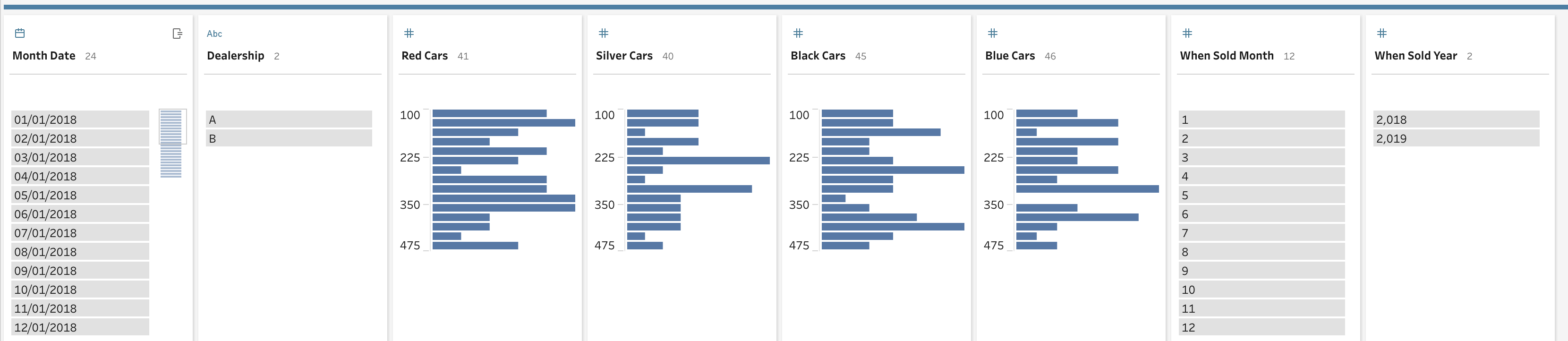
Alright, let’s take a look at the data

So we have column for each color of car sold, the dealership, a month and a year column. Simple enough. For these challenges, I like to go in the order the tasks were listed out so the first thing I’ll do is create a date field that can be used in Tableau. Tableau makes that easy by having a MAKEDATE() function
# Month Date #
MAKEDATE( [When Sold Year], [When Sold Month], 1 )
The next thing we need to tackle is the aggregation of all the car colors. Now there are at least two ways to do this that come to mind:
- The report approach
- The scalable approach
Each of these has it’s own merits. I’ll cover both and the pros and cons of each.
The Report Approach
If you’ve been asked to do this as an ad-hoc analysis and you’ll never need to do this again, then you can quickly and easily do a row level calculation for each color and off you go.
# Cars Sold (Row Level) #
[Black Cars] +
[Blue Cars] +
[Red Cars] +
[Silver Cars]
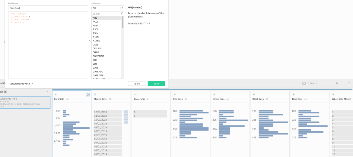
This view satisfies all the requirements. You can output this and create dashboard or analysis in Tableau and present it. And this flow will work until the end of time. But, we all know that there are WAY more that four colors of cars. So what happens when all 50+ colors of cars get added as an individual column? This way is just not manageable or scalable. We need another way. And here is where Tableau Prep comes to the rescue.
The Scaleable Approach
In order to be proactive regarding the potential for more colors to be added to our dataset, Tableau Prep allows us to do a wildcard pivot. Yes! You can pivot a collection of columns based on some criteria of column name. So to do that we’re going to go our source data and add a pivot step which will add a new branch in your prep flow.

From here you can either just drag all your color columns in but again, that won’t be dynamic to NEW color columns coming so in this case, we’ll want to click on the “wildcard pivot” link in this window. From here we see a text field appear that we can start typing into and I’ll type “Cars.” I’m also going to click on the ellipsis to set me search options to “Ends with” this will ensure that I don’t pull in any unnecessary columns into the pivot.
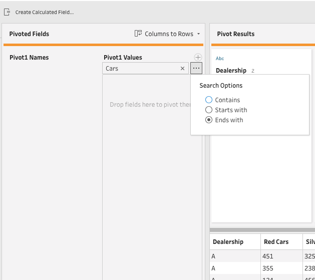
And you can see that Prep found the correct fields, pivoted them and also renamed my new values column to “Cars”

Now that I’ve pivoted my values, I’m going to need to aggregate those values for each month, year and dealership. To do that, I’ll add an aggregation step off of my pivot step. I’ll add my “Cars” column to the aggregate side and I’ll group by:
- Dealership
- Month
- Year

This steps completes the second task listed at the start of the challenge. The next thing we need to is add this aggregated column to the original dataset. What I’m going to do is drag this flow step and drop it onto the join pop-up of the clean step where we created the MAKEDATE() field. Tableau Prep will then ask us to define our join criteria and we’ll join on each of the dimension fields in our aggregation step:
- Dealership
- Month
- Year
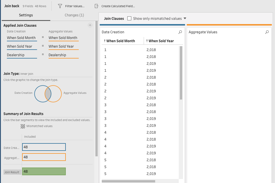
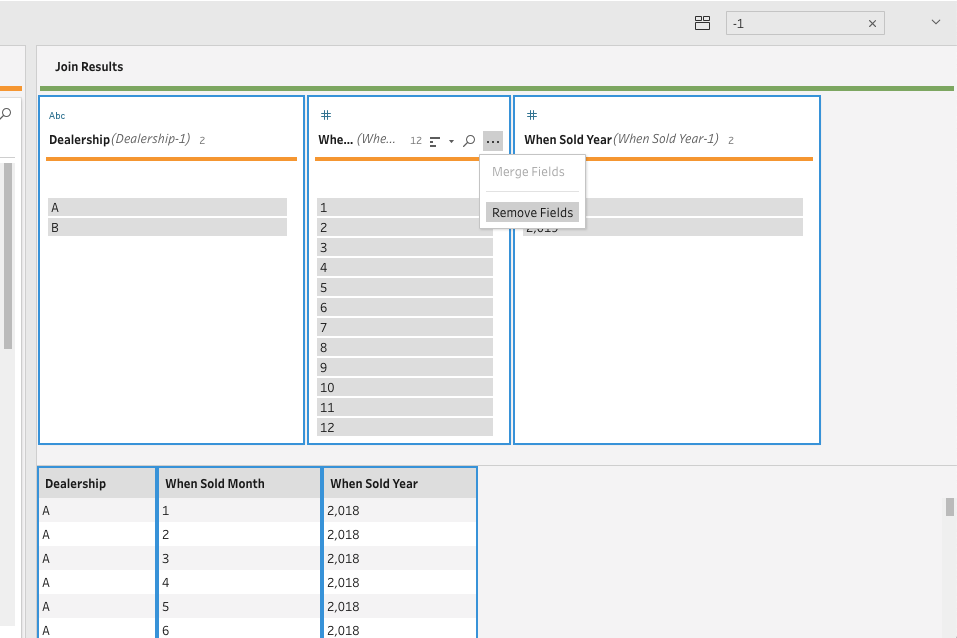
And we can see that we don’t have any mismatches and I chose to do an inner join here but you could very easily have done a left join and would get the same result. While I’m here in this window, I also like to remove my duplicate columns because Tableau Prep will return each column from both tables, so you will end up with duplicate columns for each of the three dimensions we joined on. And since they have the same name, Tableau adds a “-1” to the end of the duplicate name. This makes them easy to find by simply searching “-1” in the search bar. Then we can click on them easily remove them
And guess what? That’s it! Let’s look at our final dataset to validate

We’ve got:
- A date that will work in Tableau Desktop – [Month Date]
- Work out the total car sales per month / per car dealership – [Cars]
- Retain the car sales per colour columns – Yep!
- Export the file – Yep!
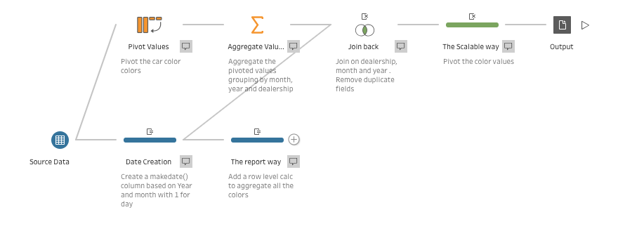
And the best part, If our dealerships start tracking the number of white, green, or any other color, this flow will automatically account for all new colors. And with the release of Tableau 2019.1 you can now put all your dataset and prep flow up on the server and set it to refresh on a schedule and always have accurate, updated sales data. Here is a screenshot of my final Prep Flow with both approaches.
Bonus points
When I was in school, I was never really as interested in bonus points because I saw it as just extra work that wouldn’t really that much of an impact on my overall grade. But now that I’m in participating member of the Tableau community, I will ALWAYS take the opportunity for extra points
So this dataset is pretty boring simply due to the fact that is manufactured data but that doesn’t we can’t do something with it.
I chose to take inspiration from Matt Chamber’s “Most Popular Car Color” bump chart he made a couple years ago that ended up going viral on Reddit. His chart is great and his tutorial just as good. If you’ve never made a bump chart I suggest you check it out.
Our data is very well suited for this chart type AND we also have raw data. This gave me the idea to add an overall running total of sales by color next to the ranked trend over time. Users could hover on a color to highlight it throughout as well being able to select a month date to see how sales were doing then. Click the screenshot for the interactive version.
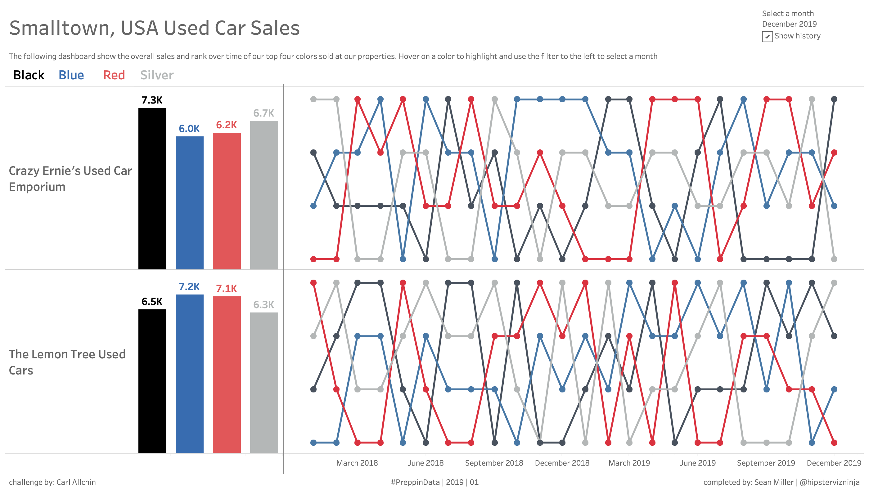
And it looks pretty sweet when you use the pages shelf and animate it on desktop!

For the first #PreppinData challenge, this was really fun and I’m looking forward to more data prep challenges!
GO FORTH AND…PREP!
Pingback: How to pivot rows to columns in Tableau Prep | #PreppinData | 2019 | 02 – MY DATA MUSINGS