Luke is back this week for another real-world challenge. Let’s take a look.

In the intro, Luke mentions that this was an actual chart he had to build for a client recently. I really like that Luke’s last two challenges have been recreations of client requests. This fits nicely into the essence of what #WorkoutWednesday is all about. Building technical tableau skills that can be taken right into your everyday work. This is also why you rarely find “novelty” chart types (sankeys, radials, etc.). Because in the business world, those chart types aren’t really practical. But charts the one above are practical. Sure, it’s a pie chart, but pie charts aren’t all that bad when used correctly and this example is no exception. These pies have only three slices at most and the sorting and color palette is consistent make ‘general’ comparisons easy to glean.
So how am I going to build this? Here are the elements that I see immediately with looking at this one:
- Pie charts
- Three dynamic slices driven by a parameter
- An alphabetized trellis (or panel) chart
Lucky for me, there are no calculation requirements which means I get to recreate this any ‘ole way I want. And the first thing I need to do is figure out the three slices. The foundation of the slices is parameter driven. My first step is to create a [Sub-Category] parameter.

Next up, I’m going to start building out the logic for the dynamic categories. The flow of this visual is as follows:
- Select a [Sub-Category] & this becomes a slice
- Then I need to somehow evaluate the higher level [Category] of the selected [Sub-Category] to see if the category of each matches the category of selected [Sub-Category]. And if so, then that become the second slice.
- Lastly, where they don’t match in step 2, I’ll group them into the last slice
So what I like to do in these situations is a text table so I can see what all my calculations are doing. And I know everything is based off [Category] and [Sub-Category] so I’ll start both those dimensions on rows.

After some trial and error I figured out that I could do this as a two step calculation. The first thing I decided to was write a calculation that fixed the higher level [Category] of the parameter select to each row.
{ MIN( IF [Select a Sub-Category] = [Sub-Category] then [Category] end ) }
When I put that on the row shelf, this is what I get

Now, I’m going to write an IF statement with this new calculation to give me my three dynamic fields for the pie slices.
IF [Select a Sub-Category] = [Sub-Category]
THEN [Sub-Category]
ELSEIF [Category] = [Fixed Category of parameter]
THEN “Rest of “+[Category]
ELSE “Other”
END
And that result gives me

when I remove all pills except that last one I get

And after some testing, this is working perfectly. Now I’ll add [Sales] and change to a pie chart. Now I need to figure out how to sort the slices. I can see from the Luke’s version that the selected [Sub-Category] is always at 12 o’clock, then “Rest of…” and finally “All Others.” So this means I can’t just sort by [Sales] but I can certainly write a calculation to force the proper sort based on the dimension member names.
IF STARTSWITH( [Slices of Pie],“Rest” ) THEN 2
ELSEIF [Slices of Pie] = “Other” THEN 3
ELSE 1
END
And now I can sort the [Slice of Pie] dimension by this new field and all is right.

Again, after some testing with different parameter selections, I’m good to go. Now for the color. While I’m sure there’s a dynamic way to do this, I could not figure it out so I went and hard coded each parameter selection to match Luke’s version. It was manual and took a while, but it works and that’s what matters.
Now, I need to make it a small multiple and I’m headed to my bookmarked site for the calculations. There are many but my favorite is Ryan Sleeper‘s.
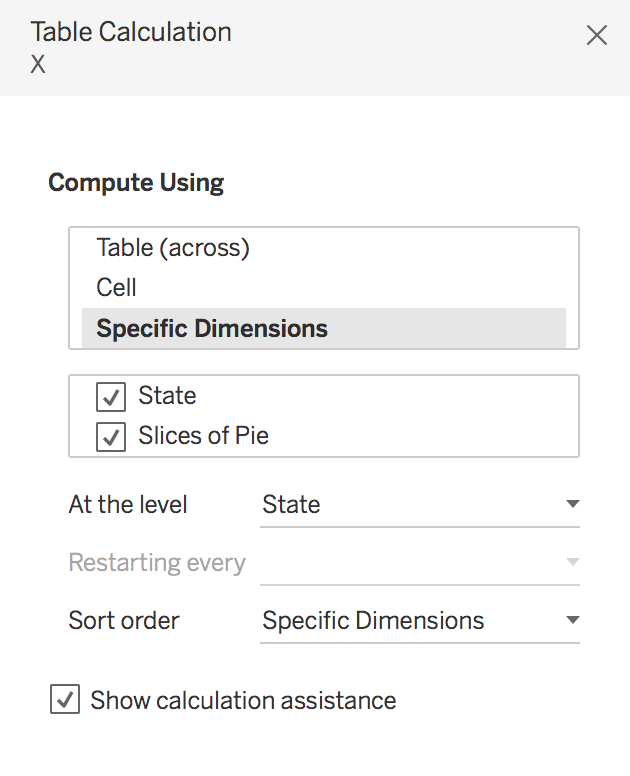
In order to get the worksheet to look just right, I need to edit both table calculations to compute using both dimensions available with [State] being first. And then set the level of detail to [State]. The dialog box should look like this

Now I need to add [State] to the label shelf of the marks card and set the alignment to the top vertical and center horizontal. Now I’ve got the main viz complete. All I’ve got to do now is the legend and title I’m be all set.
For the legend, it’s pretty straightforward with the same discrete dimension used for the pie slices with the addition of an ASCII character, which is a thick vertical bar. My favorite site to get ASCII symbols is coolsymbol.com
And that’s it! Click for the interactive version
