The Pareto principle was developed by the Italian economist Vilfredo Pareto when, in 1906, noticed that 80% of the land in Italy was owned by 20% of the population. And thus, the 80/20 rule was born and business leaders have been stuck on it ever since 🙂
The Pareto chart is based on the principle of the same name and is used to quickly analyze if the majority of a measure is based on 20% of your “things.”
This week’s #WorkoutWednesday challenge from Curtis tackles this very chart type…with a few extra twists thrown in for good measure. So let’s get to it. Here’s what we’re gonna create and here are the requirements:
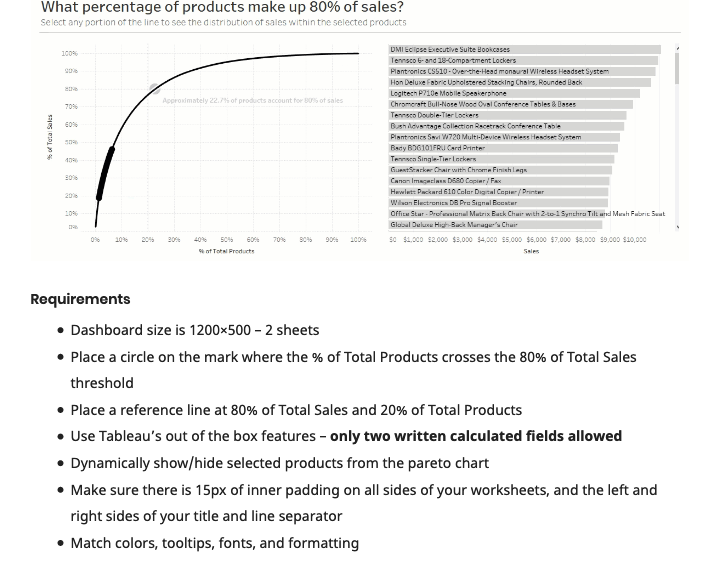
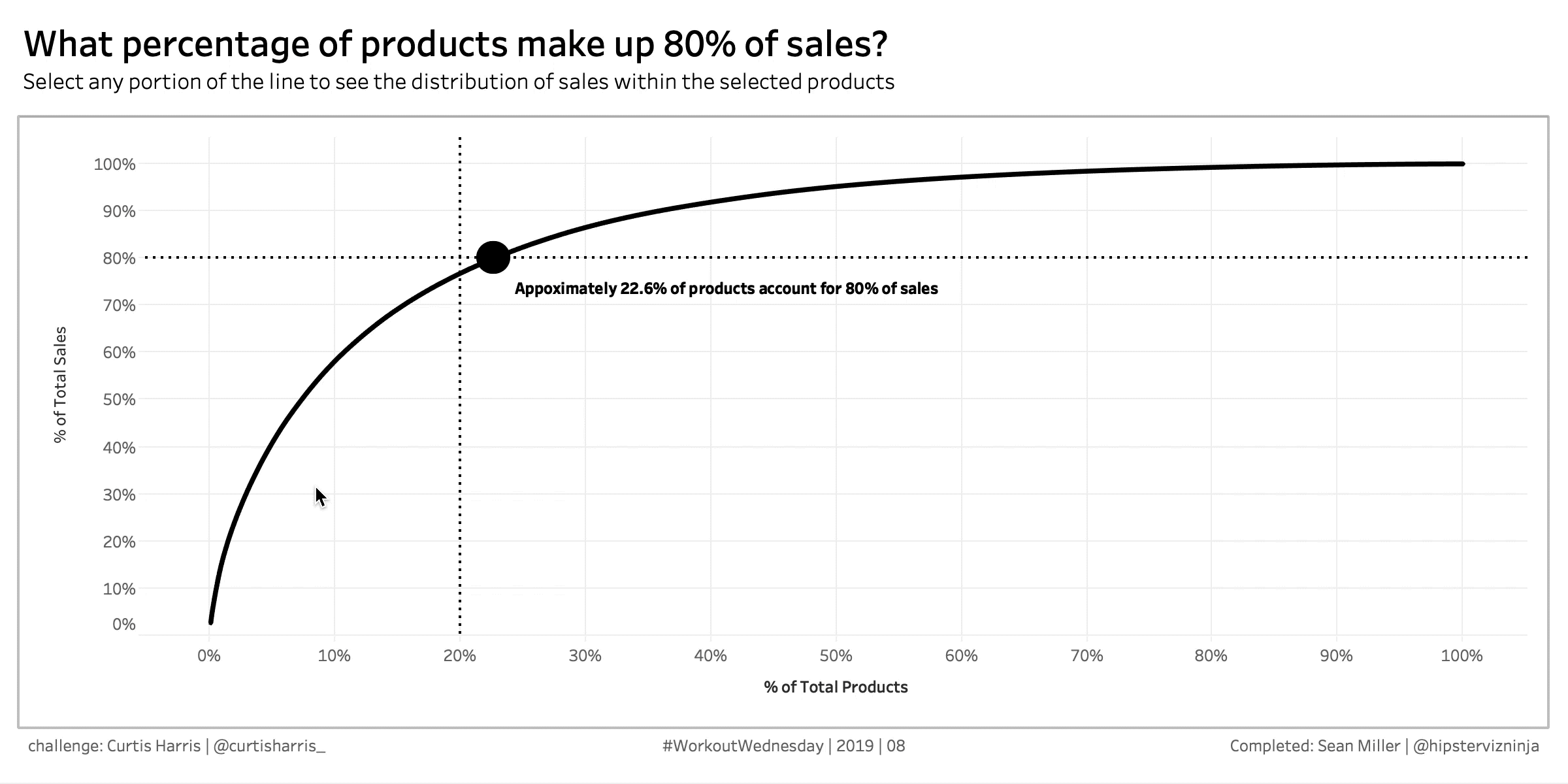
The Pareto chart is the one the left and we’ll have an interaction that will allow us to the individual products selected and their sales. Additionally, we’ll have a mark at the point of intersection between 80% of sales and 20% of products. You can see from Curtis’s instructions that we can use two calculated fields
Guess what? You can, right now go and build a Pareto chart without any additional fields. That’s right! Pareto charts can be built in Tableau out of the box. This just goes to show the analytical power of Tableau. This is a fairly advanced chart type and the fact that Tableau can build it using out of the box functionality is pretty dang cool.
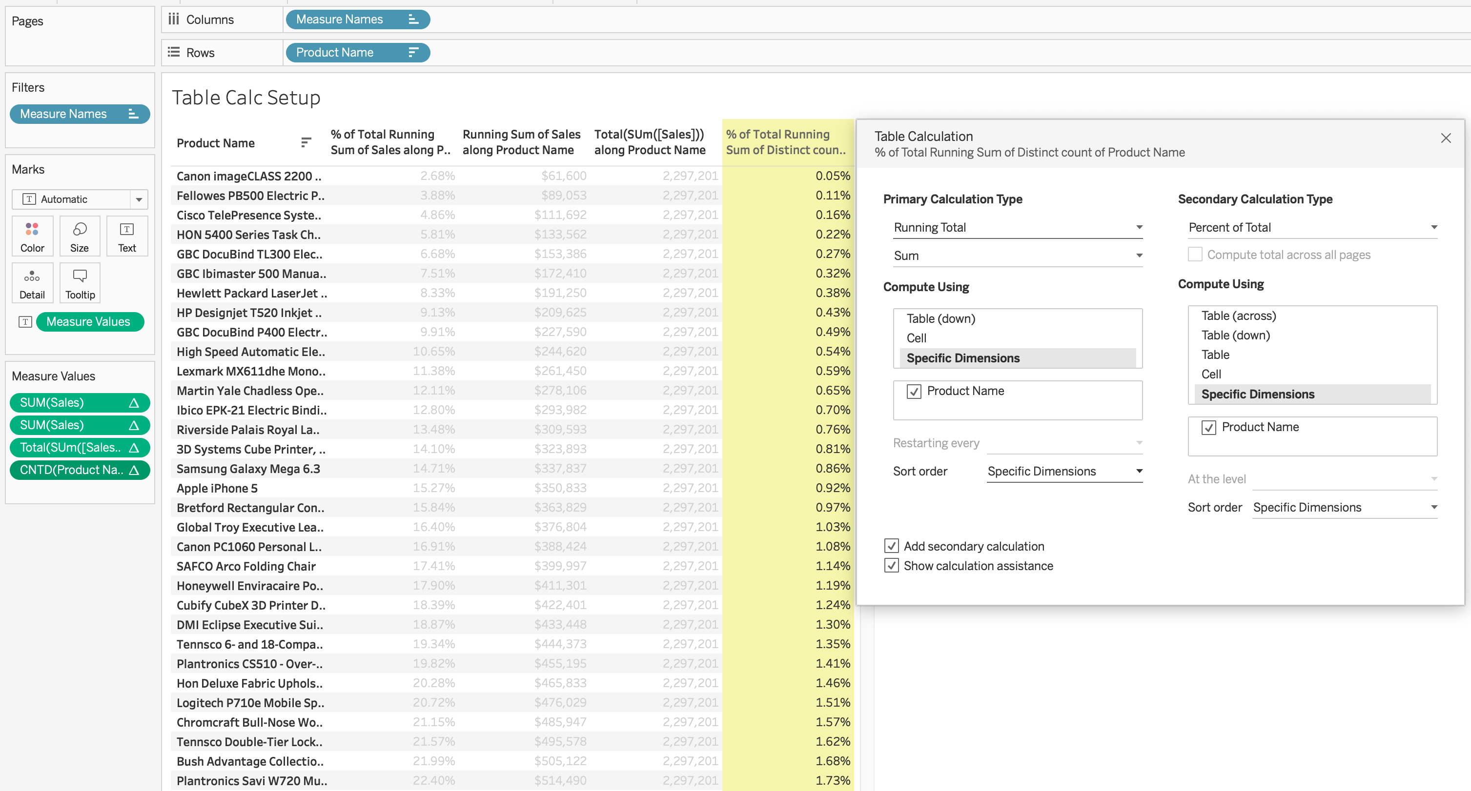
Now, Pareto charts require an understanding of table calculations. If you don’t have any at this time, I’ll attempt to explain what’s happening as we go along. That being said, it is 10000% easier to understand table calculations with a text table. So that’s how we’re going to build everything we need for this chart and then we’ll simply rearrange the pills once we’re done to create the visual.
We can see from the title that we’re looking at [Sales] by [Product Name], so let’s start there. Note: I sorted descending by [Sales]

The basic Pareto calculation you need to know is “Running aggregation / total aggregation” As long as you remember that basic formula can create any Pareto chart you wish.
Let’s add a new pill to measure values which is a running total of sales.
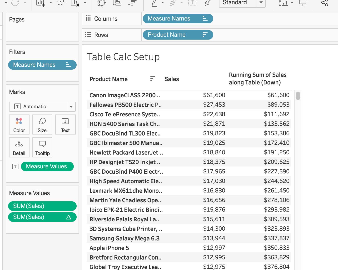
Tableau will default to calculate your table calculation for the entire table, let’s edit our table calculation and have it calculate along each product name

Why did we do this? Well, if we were to add in additional dimensions to the view, if we calculate using the default, Tableau add those dimensions to our table calculation. We don’t want this, so we are telling Tableau, “I don’t care what other dimensions I add to this view, this particular calculation will be computed across [Product Name] only.”
Remember our Pareto formula? This is the numerator. Now, let’s tackle the denominator. We need to divide each row above by the total [Sales] of all products. Tableau has a TOTAL() function that will do just that. Let’s add a new calculation to measure values
#Total Sales#
TOTAL( SUM( [Sales] ) )

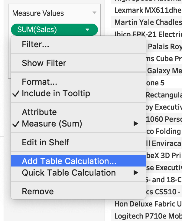
One option from here is to write another calculation to divide these fields but…(Stop working ahead! [in my best teacher voice 🙂 ] ) Tableau has the power do all this for us. Let’s go to the first pill in the measure values shelf and add a table calculation
From here we can select “Running Total – Sum”, Compute using specific dimensions – Product Name and click “Add secondary calculation.” Then, we can select “Percent of Total”, Compute using specific dimensions – Product Name
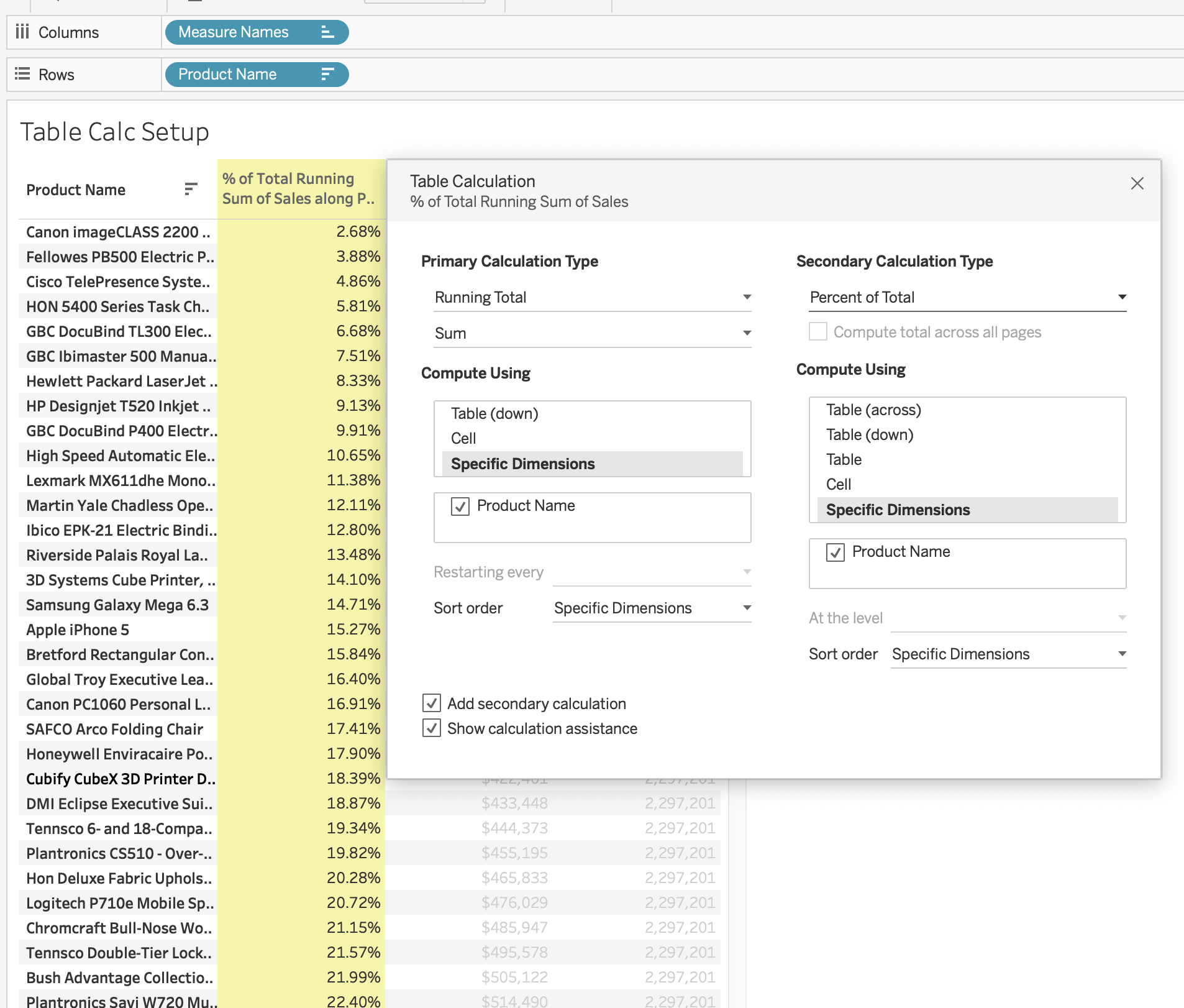
Now, because we’ve built our view this way we can quickly validate we set up our table calculations appropriately by simply picking a row and dividing the two to make sure we get the correct result.
We do
Now the next thing we need to do is nearly the exact same thing, except with a different metric. If we look back at our original, we can see that the y-axis is “% of total sales” (that’s what we just created) and the other axis is % of total products”
“But Sean”, I hear you cry, “products is a dimension, and you said we need a measure, so what gives?!”
Well, my dear friend, we’re going to create a measure. Let’s do that really cool drag-and-drop trick in Tableau where we hold down the “Alt” key on our keyboard while dragging [Product Name] to measure values and see what happens…

Pretty nifty, eh?!
Let’s select CNTD() and you should see a 1 for each row. Now let’s do the exact same thing as before, right click on the pill and select add a Table Calculation, running total using [Product Name], add a secondary calculation of “percent of total” using [Product Name] and presto-change-o…
Yes, we are so close! Now, we can clean up our worksheet a bit by removing the intermediary sales columns we used for validation. So you should only two columns on measure values % of total sales and % of total products. like this:

From time to time, it’s nice to just relish and celebrate the beauty of exactly what Tableau so amazing. Because is JUST 4 CLICKS we can go from this crosstab view to a Pareto chart. Watch…

- Product Name to the detail shelf of the marks card
- % of total sales to rows
- % of total products to columns
- Change mark type to line
I don’t know about but that is just so simple and so cool.
Okay, here we are, we’ve got our Pareto chart looking fly and while we’re here, we can go ahead and add our reference lines to each axis. We’re going to set a CONSTANT reference line on the sales axis for 80% and a CONSTANT reference line on the products axis at 20%
Now it’s time to dive into the cross mark, or the dot at which we can find the % of total products that makes up 80% of sales.
Instead of taking you through all of the different wrong calculations I attempted to get this to work, I’ll give you my solution and I’ll explain how it works
# Sales Mark #
IF LOOKUP( RUNNING_SUM( SUM( [Sales] ) ) / TOTAL( SUM( [Sales] ) ),-1 ) < .8
AND LOOKUP( RUNNING_SUM( SUM( [Sales] ) ) / TOTAL( SUM( [Sales] ) ),1 ) > .8
THEN RUNNING_SUM( SUM( [Sales] ) ) / TOTAL( SUM( [Sales] ) )
END
So what’s happening here? The best way to understand these complex calculations is to look from the inside out. The first thing to notice is that we’re repeating our measure three times. And that measure is our % of total sales y-axis measure. Now even though we did everything through the Tableau UI, we could’ve very easily just written this calculation and achieved the same result. Now that we know what our measure is we can begin looking outwards; the LOOKUP() function.
With the LOOKUP() function, we’re telling Tableau for each row evaluate the row above and check if that row’s measure is LESS THAN 80% and also evaluate the below and check if that row’s measure is MORE THAN 80%. When Tableau finds a row that satisfies both arguments, write the measure of that row.
If your mind is jelly right now, it’s okay. Let’s see it visually now. Drag this new field into Measure values and scroll down until you see values
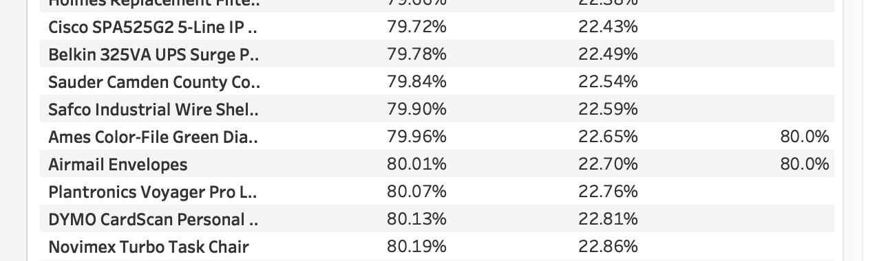
Okay, so we can see that two rows satisfied our argument. Let’s see why?
Let’s look at the “Ames Color-File…” row

The row above LOOKUP(measure , -1) is less than 80% AND the row below LOOKUP(measure , 1) is greater than 80%, therefore
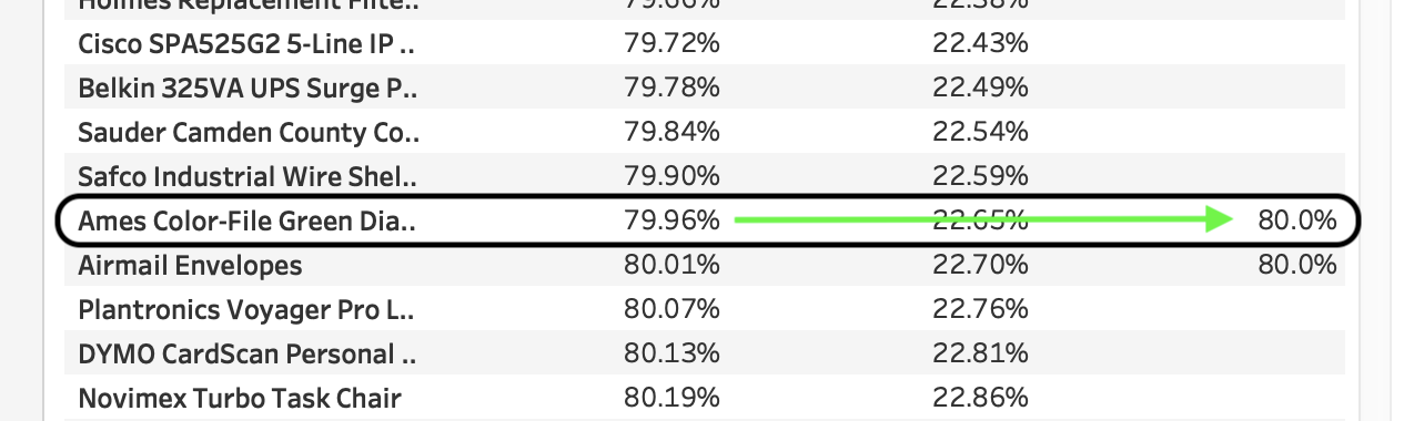
stamp the measure for that particular row. And in this case, our data has two rows that satisfy this argument.
Now let’s go back to our Pareto sheet and put this new field on the rows shelf next to the existing measure. And make it a dual axis, don’t forget to sync your axes.
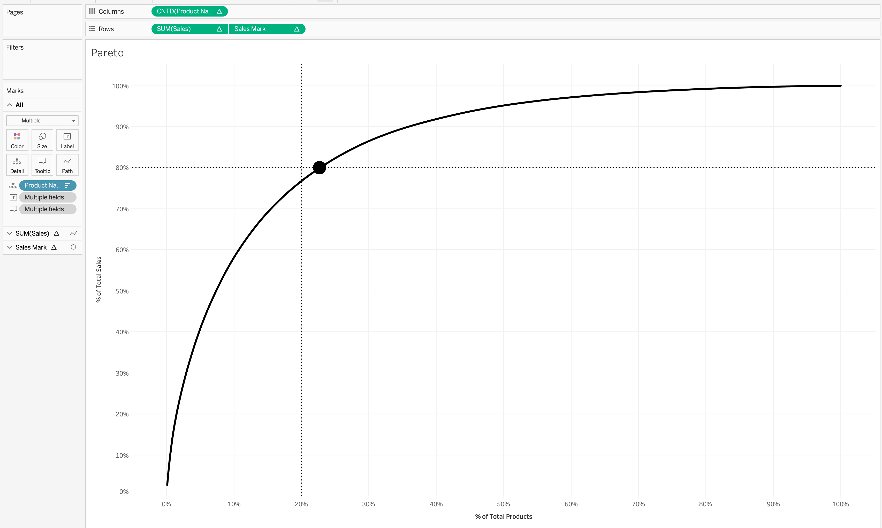
Looky there! Now we can duplicate our calculated field with the exact same argument, or the IF portion, and replace the return statement, or that just after “THEN” to the % of total products calculation. we can use this field and our other field to label our circle mark.
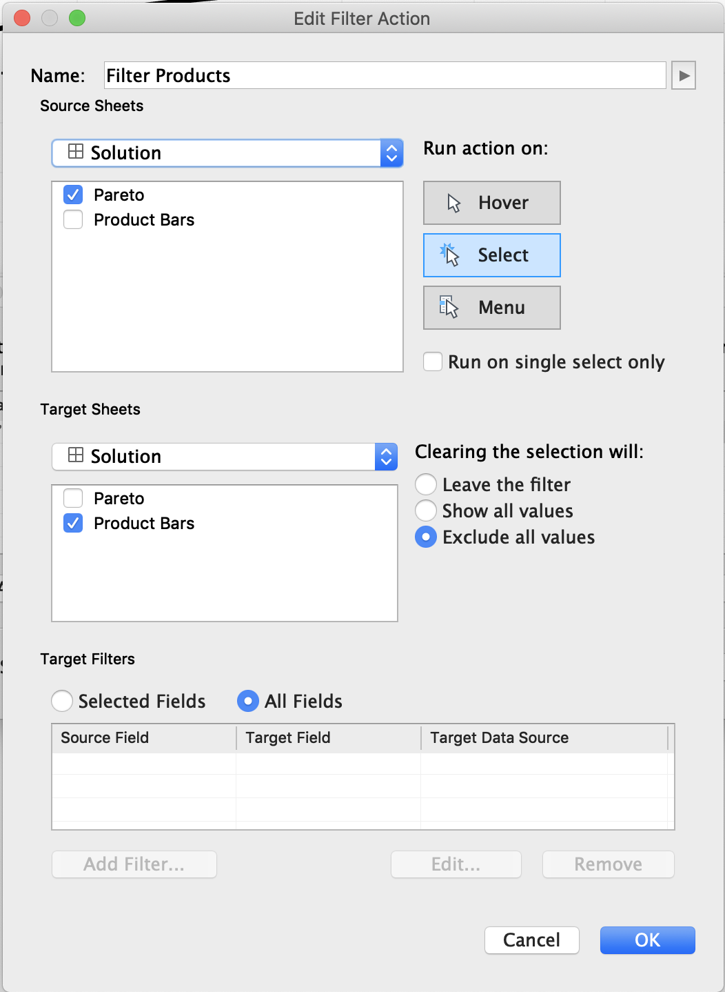
Alright now, for the next part of the dashboard which is the interactivity portion. In order to do that we need to make a bar chart by sales of only those products we select. One option we have is to create a set action but we’ve already used our two calculations which was the limit Curtis stipulated.
So we’re gonna simply do this with a simple filter action on a dashboard and select to exclude all values when cleared.
And voila!
GO FORTH AND VIZ!