Time to dust off the old blog and get back into the swing of posting regular posts again. Apologies for the hiatus but by #WorkoutWednesday walkthroughs are back! I’m getting back into things with Luke’s Week 41 challenge.
This week's #WorkoutWednesday2019 will test your skills on building calculations and use of set actions as you find which customers are the most thrifty/costing the company cash. ???https://t.co/3M5Z77cDYM@AnnUJackson @curtisharris_ @lorna_eden pic.twitter.com/9P0jQi39sj
— Luke Stanke ? (@lukestanke) October 9, 2019
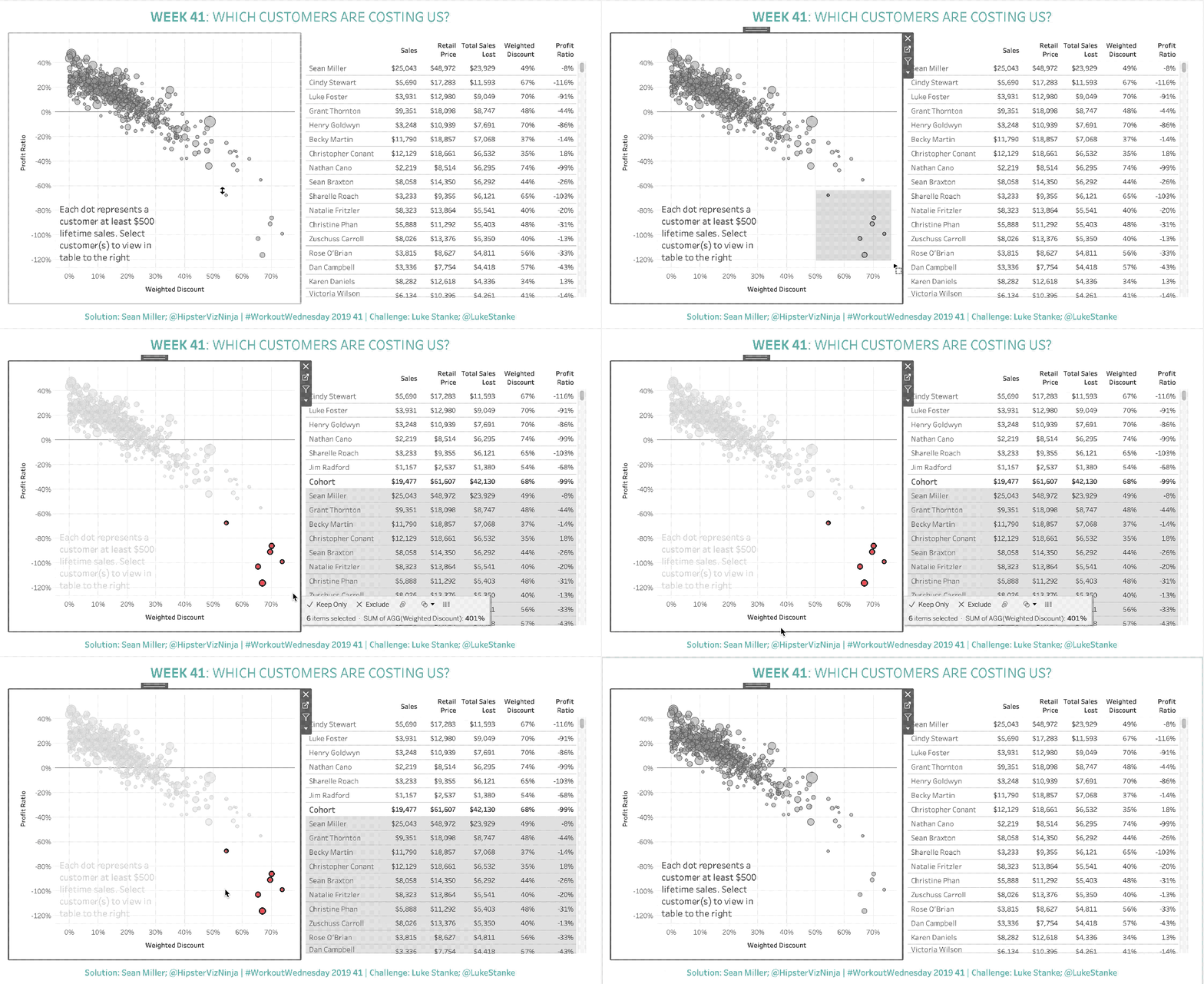
Looks like we’re gonna create a dashboard to allow the user to create an ad-hoc, on-the-fly cohort for analysis. There are many ways to create cohorts in Tableau and many have a calculated fields involved. But the thing with calculated fields is you tend to sacrifice the ability for your cohort to be dynamic. Thanks to Tableau’s powerful set actions capability, we now have the ability to create a cohort as simply as clicking and dragging.
Let’s take a look at the requirements


Woah, those are some detailed requirements, which is great because you can point by point and complete this challenge.
Luke even provided the base calculations for everything that we’ll need so we’ll pick up this up with both sheets created and we’re ready to add the interactivity.
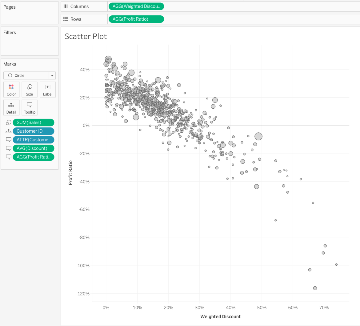
So before you start your scatterplot should look like this
You’ll notice that I’m using [Customer ID] on detail as opposed to [Customer Name]. Did you know that the Superstore dataset (.tds) that ships with Tableau has ID fields hidden? It sure does. I only learned this by following fellow #SocialAmbassador Vince Baumel who shared this #TinyTableauTip a while back
Here's a #tinytableautip I just discovered for the first time. Good old Superstore has a few fields hidden by default, the little rascal! Connect to Superstore, right click in the data pane, and select Show Hidden Fields to see some handy ID fields! pic.twitter.com/UVzP5kqXJr
— Vince Baumel (@quantum_relic) July 5, 2019
It’s generally best practice to use an ID field in lieu of a “name” field as there may very well be two customers with the same name. So by putting the [Customer ID] on detail, we’ll be sure to get a dot (and a row, for that matter) for each customer.
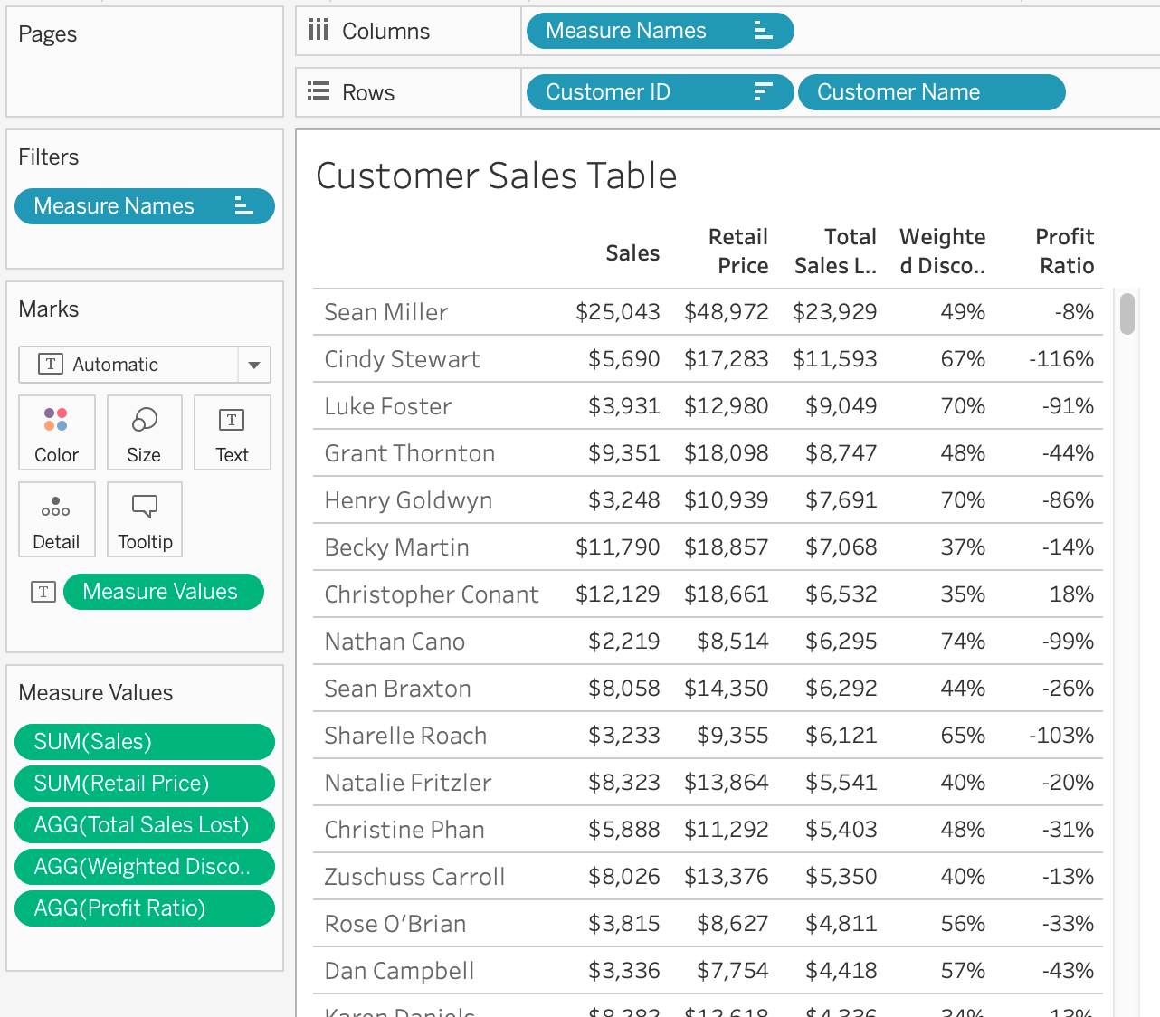
Okay, so we’ve got our scatter plot and our customer table

Again, using [Customer ID] as the top level dimension so we get a true row per customer. And now we’re ready to start figuring out the interactivity and how to set up our set action. Let’s remember what we need to have happen; when we select customer(s) on the scatter plot, those customer rows on the table “bubble up” to the top as well as show the aggregate totals for the selected cohort. This is important because it’s not going to be as simple as a filter action because we’re not filtering the customer table, we’re manipulating the display of it.
So here’s my solution: Let’s create a set based on [Customer ID] and only put a handful into the set to start.

Just something simple to do some testing with, we’ll change this later after get everything right. This set can actually be used on the scatter plot for coloring the selected marks.

Now, in order to use set actions, and get our Sales table to filter we need to have a calculated field of some sort
##Customer Cohort##
IF [Customer Set]
THEN [Customer ID]
END
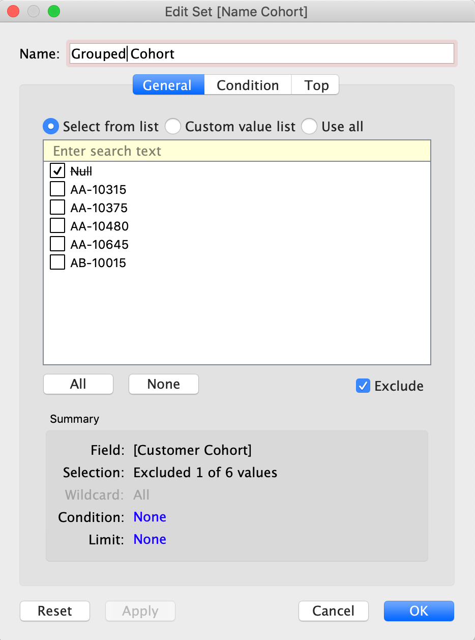
For any customer id that is added to the set, return that [Customer ID], otherwise null. Now, in order to use this dynamically and have the Sales table “bubble up” the selected customers, we’re going to have to use a high level dimension that groups those customers together. And the best and easiest way to do that is to use a set. My solution includes an additional set that will be based off the [Customer Cohort] calculated field we just created. And because of the way I set up the calculation there will ALWAYS be a null value. And by default, I will choose to exclude that value in any view I create.

Now, we can take this set and add it as a dimension at the highest level of our Sales table

PERFECTO! Now I can hide that header and figure out the row banding in order to get the desired result
Now how do we get the aggregated totals to show for our selected cohort? My initial thought was to just add subtotals but wasn’t sure if I needed to do anything fancier/trickier. Considering there wasn’t a distinct bullet item I figured I was okay to but before doing so I also went and check Luke’s version and sure enough right there at the bottom is a subtotal row. HOORAY!
So let’s add subtotals. Now by default, your only option in Tableau is to turn on ALL subtotals but that’s not what we want…
For each dimension, we have the ability to turn off subtotals but unchecking “Subtotals” in the context menu for any dimension.

Let’s uncheck that one and then all is well. Lastly, we just need to do a quick bit of formatting to change the word from “Total” to “Cohort.” That can be achieved by right clicking on the “Total” row and selecting format. From there you can change the alias and format it to be a bit larger font and bold.
So now that we’ve got each worksheet working with our set, we’re ready to build the dashboard and the set action. Remember that we want the table to reset when no customers are selected. That simply means we want to “Exclude all members” when the selection is cleared.

Let’s test it.

Awesome Opossum!
And that is how you can use set actions to analyze custom cohorts dynamically.
Go Forth and Viz!