Former #IronViz champion and just about the nicest guy you’ll ever know, Curtis Harris has also joined the #WorkoutWednesday2019 crew. And week 4 is his inaugural post. Let’s take a look!

Alrighty, here we go. We’ve got a step line chart with circles on the points of change, sized by absolute change, colored by polarity. And below that, we have a simple bar chart emphasizing the change. In the upper right corner, we have a BAN showing the current value and lastly a title in the upper left.
The Data
We can see in Curtis’s directions, he has instructed us that we need to some data prep as part of/prior to completing this challenge. The data is structured how you’ll find a lot of data:
- Dimension(s)
- Start Date
- End Date
And in many cases, as analysts, we’re going to need to “pad” the data. Meaning, we could quickly and easily calculate the number of days between the start and end dates of each row and then aggregate them. But that doesn’t really tell us much. Take, for instance, I deal with healthcare data and a lot of my clients want to be able to see at any given how many open beds they have in the emergency room. A table structured like the one above will not work as is for this question. No, what I really need to do is pad the data with every hour of every day between the min and max dates of the dataset. Then I’ll be able to pick any day and hour and count the number of rows for it.
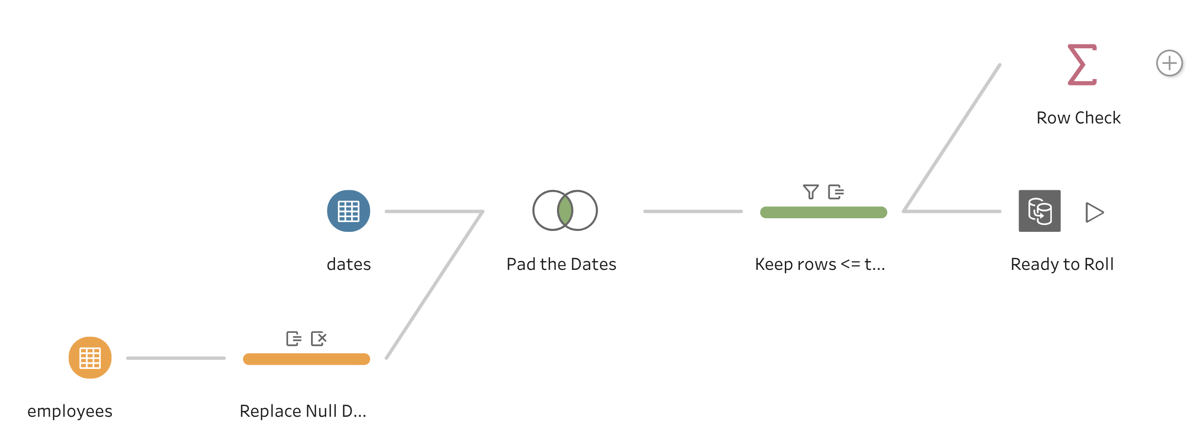
Or in the case of this challenge, we’re looking at HR headcount data and are being asked to visualize our headcount change over time. And we’ll need to be able to show a continuous list of dates. And anytime, you need to pad your data, the best way to do that is with a simple one column table of dates and join that to our original data. And for this challenge, I prepped my data in Tableau Prep. Below is a screenshot of Prep Flow and I’ll highlight the most important steps.

Step 1: Replace null dates
In the directions, Curtis said, replace null dates with today’s date. That’s simple enough with the IFNULL() function.
# Term_Date_Today #
IFNULL( [TermDate] , TODAY() )
Step 2: Join on our date field
We don’t want to join every row in our data to every row in padding dataset. We only want to bring in a padding row for those rows that are GREATER THAN our start date. Our join clause looks like this:

Doing this will duplicate each row in my original dataset for every date that greater than the start date. But I don’t necessarily want every single date, I want the duplication to stop on or after my end date. We’ll tackle that in the next step
Step 3: Removing dates after end date
Here is a sample of what my data look like at this point:

Now what I need to do keep the rows where [date] is less than or equal to [Term_Date_Today]. I can write that as a boolean.
# Keep Rows #
[date] <= [Term_Date_Today]

Now I can add a filter to only keep TRUE
Curtis also gave us a nice spoiler that said our final dataset needs to be 5,947 rows and with a simple aggregation step, I can quickly confirm that’s what I have.

And we’re ready to roll!
EDIT: I’M TERRIBLE AT READING DIRECTIONS. CURTIS EXPLAINED IN HIS INTRO PARAGRAPH THAT WE NEEDED TO USE THAT DATA SOURCE WINDOW IN TABLEAU DESKTOP. LUCKILY, ALL THE ABOVE STEPS CAN BE REPLICATED IN DESKTOP JUST AS IN PREP
STEP LINE
The first thing we need to do is use the [date] field on columns, set to exact (continuous) date and [Number of Records] of records on rows. Then click the path shelf and ensure you’ve selected the step line option.
This particular visual would look good as a jump line

Now, Curtis needs us to add a circle for each point where the line changes. I tried several different things that didn’t end up working out very well. Then one of the things I thought about was somehow finding a way to manipulate the size of the circles and that’s exactly what I ended up doing. That’s right, just duplicate [Number of Records].

Now, to manipulate the size of the circles I need to calculate the difference from any point to it’s previous point. And I do that with LOOKUP() table calculation.
# SIZE #
ABS(ZN( SUM( [Number of Records] ) )
–
LOOKUP( ZN( SUM( [Number of Records] ) ), -1 ) )
One thing to remember when using size shelf of the marks card is thinking about how you want to encode negative values. Meaning, for this visual, I want highlight the magnitude of the change so that’s I wrapped the entire calculation in ABS() or absolute value.
When this is on the size shelf of circle marks card. I need to edit the size to make sure that 0 is as small as possible.

And now when I make it a dual axis and sync the axes:
Now let’s indicate whether the change was positive or negative.
# Color #
ZN( SUM( [Number of Records] ) )
–
LOOKUP( ZN( SUM( [Number of Records] ) ), -1 ) < 0
We’re simply testing whether or not our difference table calculation is positive or negative as a boolean.
Then we can put this on the color shelf of the circle marks card and format the colors to be a soft grey for FALSE and highlight red for TRUE. Then I’ll drop the opacity down to 60%

I’ll also drop the weight of the line a bit to make the circles jump out a bit more. And that should wrap up the technicalities of the step combo chart.
Bar chart
This chart is intended to show the actual change. It’s very similar to the line mark of our first sheet but instead of [Number of Records] I’ll need to show the difference from the previous point which is out-of-the-box quick table calculation as a bar chart.

Now, reuse the [Color] field on color

And we’re ready for formatting and dashboard building.
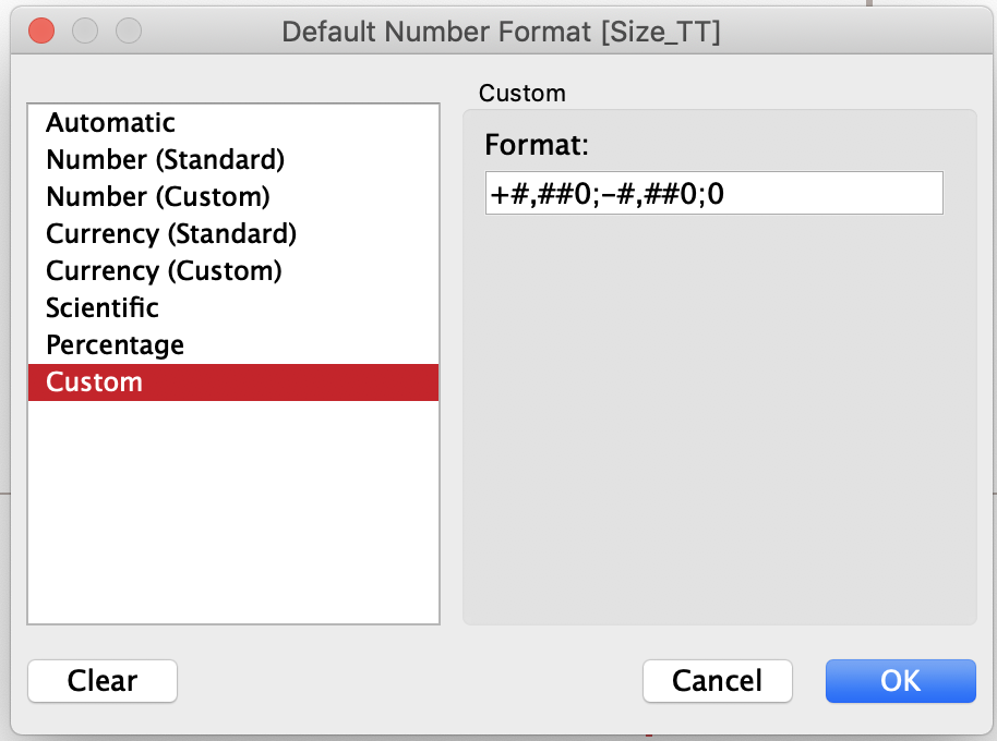
The only quick thing we need to do is get the +/- signs in the tooltips and the best way to do this is with custom formatting.

This custom formatting is set up such that you can dynamically format your numbers based on polarity. The different polar formats are separated by the semicolons in the above screenshot. This is the blueprint:
(Positive Numbers) ; (Negative Numbers) ; zero
The BAN
We can see at the top right of our example that there’s a sheet that shows us the current number of employees as of the current date. So in order to get to this number, I’m going to use a different table calculation. This time I’m going to use a couple different table calculations.
# Most Recent Date #
IF LAST() = 0 then ATTR( [Term_Date_Today] ) END
I certainly could’ve done this with an LOD but I am on a roll with table calcs with this one, so why break precedence.
Now in order to get this calculation to work, I need to have [date] in the view. However, when I do that I’m going to get a mark for each day in my dataset when I just need the last one so I’ll do another table calc.
# Last Record #
LAST() = 0
I’ll put that in the filter and set to TRUE.
Now just throw on [Number of Records] to the label shelf and we’re all set!
